
aid
US /ed/
UK /eɪd/
- Transitive Verb
- To help others and provide things
- Noun (Countable/Uncountable)
- Action of giving help to others
- Money or help given to those who need it
A2TOEICMoreanimate
US /ˈænəˌmet/
UK /'ænɪmeɪt/
- Transitive Verb
- To give life, energy, or motion to something
B2Moreassistance
US /əˈsɪstəns/
UK /əˈsɪstəns/
- Uncountable Noun
- Act of helping someone
A2TOEICMoreat the same time
US
UK
- Phrase
- Simultaneously; at the identical moment.
- Nevertheless; however; used to introduce a contrasting or qualifying statement.
A1Moreaxis
US /ˈæksɪs/
UK /ˈæksɪs/
- Noun
- A line about which a rotating body turns
B1Morebubble
US /ˈbʌbəl/
UK /ˈbʌbl/
- Countable Noun
- A small ball of air inside of a liquid
- Intransitive Verb
- (Of a liquid) to produce bubbles, as when boiling
- To show intense emotion, e.g. excitement, anger
B1TOEICMorecatastrophe
US /kəˈtæstrəfi/
UK /kə'tæstrəfɪ/
- Noun (Countable/Uncountable)
- Very bad disaster causing much suffering, etc.
- A complete failure; a fiasco.
B2Morecatch up
US /kætʃ ʌp/
UK /kætʃ ʌp/
- Phrasal Verb
- To become equal with another person
- To inform others of the latest news
- Verb (Transitive/Intransitive)
- To do something that you have not been able to do recently.
- To meet someone you know in order to talk to them and find out what they have been doing.
A1Morecivil
US /ˈsɪvəl/
UK /ˈsɪvl/
- Adjective
- Of citizens of a country; not military, criminal
- Acting in a polite, but not truly friendly manner
B1Morecolonize
US /ˈkɑləˌnaɪz/
UK /'kɒlənaɪz/
- Transitive Verb
- To take control over place and live there
B2Morecrew
US /kru/
UK /kru:/
- Countable Noun
- Organized group of workers (e.g. on a ship)
- Skilled group of people working together on a task
- Intransitive Verb
- To work as part of a crew.
A2TOEICMorecrowded
US /ˈkraʊdɪd/
UK /ˈkraʊdɪd/
- Transitive Verb
- To force too many things, people into
- Intransitive Verb
- (Of a lot of people) to go together in small place
A2Moredatum
US /ˈdetəm, ˈdætəm, ˈdɑtəm/
UK /ˈdeɪtəm/
- Noun
- Item of factual information
B1Moredisparity
US /dɪˈspærɪti/
UK /dɪˈspærəti/
- Noun (Countable/Uncountable)
- Unfair difference between things; inequality
- Inconsistency; incongruity.
B2Moreemerge
US /ɪˈmɚdʒ/
UK /ɪ'mɜ:dʒ/
- Intransitive Verb
- To rise or appear out of some background
- To become known or apparent.
A2TOEICMoreenormous
US /ɪˈnɔrməs/
UK /iˈnɔ:məs/
- Adjective
- Huge; very big; very important
- Very great in size, amount, or degree.
A2Moreepidemic
US /ˌɛpɪˈdɛmɪk/
UK /ˌepɪ'demɪk/
- Adjective
- Disease that spreads quickly affecting many
- Noun (Countable/Uncountable)
- Something that spreads suddenly and widely
B2Moreexpectancy
US /ɪkˈspɛktənsi/
UK /ɪkˈspektənsi/
- Uncountable Noun
- Excited feeling that something is will happen soon
B1TOEICMoreflu
US /flu/
UK /flu:/
- Noun (Countable/Uncountable)
- Illness causing headache, fever etc.
- A specific instance or bout of influenza.
B2Moreforge
US /fɔ:rdʒ/
UK /fɔ:dʒ/
- Transitive Verb
- To create something by hammering hot metal
- To form something new, such a relationship
- Countable Noun
- A furnace to melt and shape metals with heat
B1TOEICMoregain
US /ɡen/
UK /ɡeɪn/
- Verb (Transitive/Intransitive)
- To increase in something, such as weight
- To get something wanted, needed or valued
- Noun (Countable/Uncountable)
- An increase in something, such as weight
A2TOEICMoregap
US /ɡæp/
UK /ɡæp/
- Noun (Countable/Uncountable)
- Distance between two objects
- A difference or disparity.
- Verb (Transitive/Intransitive)
- To make an opening or gap in something.
- To bridge or close a gap.
A2TOEICMoreglobal
US /ˈgloʊbl/
UK /ˈgləʊbl/
- Adjective
- Concerning, involving, affecting all of something
- Of, affecting, or involving the entire world
A2TOEICMorehave to
US /hæv tu/
UK /ˈhæv tə/
- Auxiliary Verb
- Must do
A1Morehistorical
US /hɪˈstɔrɪkəl,-ˈstɑr-/
UK /hɪˈstɒrɪkl/
- Adjective
- Connected with the past
B1Morehuge
US /hjudʒ/
UK /hju:dʒ/
- Adjective
- Very very large
A2Moreimpact
US /ˈɪmˌpækt/
UK /'ɪmpækt/
- Noun
- A striking effect or result to hit with force
- Act or force of one thing hitting something else
- Verb (Transitive/Intransitive)
- To hit or strike someone or something with force
- To have a strong effect on someone or something.
A2TOEICMorein ways
US
UK
- Phrase
- In a manner or by methods that.
- In certain respects or aspects.
A1Moreindependence
US /ˌɪndɪˈpɛndəns/
UK /ˌɪndɪ'pendəns/
- Uncountable Noun
- Having the freedom to make your own decisions
- The state of not relying on others for financial support or assistance.
A2Moreindustrial
US /ɪnˈdʌstriəl/
UK /ɪnˈdʌstriəl/
- Adjective
- Concerning making things in factories
- Noun
- A worker in industry.
- A company involved in industrial production.
A2Moreinland
US /ˈɪnlənd/
UK /ˌɪnˈlænd/
- Adjective
- Concerning areas that are not near a coast
B1Morelifetime
US /ˈlaɪfˌtaɪm/
UK /ˈlaɪftaɪm/
- Noun (Countable/Uncountable)
- The time between birth and death
- An opportunity that is unlikely to occur again.
- Adjective
- Lasting for the duration of someone's life or the existence of something.
B1Morelook at
US /lʊk æt/
UK /luk æt/
- Phrasal Verb
- To use your eyes to focus on something
- To focus your eyes on something carefully
A1Moremedal
US /ˈmɛdl/
UK /'medl/
- Noun (Countable/Uncountable)
- Metal award, often round, usually for courage
- An emblem or badge of honor.
B1Moremove away
US /muv əˈwe/
UK /mu:v əˈwei/
- Phrasal Verb
- To relocate; to go and live in a different place.
- To physically create distance; to step back or aside.
A2Moreneat
US /nit/
UK /ni:t/
- Adjective
- That you approve of; cool
- (Of alcohol) not weakened with water or a mixer
A2Moreoil
US /ɔɪl/
UK /ɔɪl/
- Uncountable Noun
- A liquid used for frying foods
- Thick, black liquid in the ground used as fuel
- Transitive Verb
- To add a liquid for frying foods
- To put liquid in a machine so it will run smoothly
A2Moreplot
US /plɑt/
UK /plɒt/
- Countable Noun
- Small piece of land for a house growing crops etc.
- Series of events that form the main story
- Transitive Verb
- To mark a path, etc. on a map, using lines or dots
- To devise or develop a dramatic storyline
B1Moreprogress
US /ˈprɑɡˌrɛs, -rəs, ˈproˌɡrɛs/
UK /'prəʊɡres/
- Verb (Transitive/Intransitive)
- To move forward or toward a place or goal
- To make progress; develop or improve.
- Uncountable Noun
- Act of moving forward
- The process of improving or developing something over a period of time.
A2TOEICMoreprovince
US /ˈprɑvɪns/
UK /'prɒvɪns/
- Noun
- Subject that a person has a good knowledge of
- Area a country is divided into outside the capital
B1Moreremarkable
US /rɪˈmɑrkəbəl/
UK /rɪˈmɑ:kəbl/
- Adjective
- Interesting and unexpected, worthy of notice
- Worthy of attention; striking.
A2TOEICMorerevolution
US /ˌrɛvəˈluʃən/
UK /ˌrevə'lu:ʃn/
- Noun
- When a group overthrows an existing government
- Sudden or significant change in something
B1Morerural
US /ˈrʊrəl/
UK /ˈruərəl/
- Adjective
- Concerning the country as opposed to the city
B1Moresame time
US
UK
- Phrase
- Occurring simultaneously or at the same point in time.
- At the identical time as before; recurring at a fixed hour.
- Noun
- An equal duration or period.
A1Moreslow down
US /slo daʊn/
UK /sləu daun/
- Phrasal Verb
- To reduce the speed
- To become less active or busy.
A1Morespeed up
US /spid ʌp/
UK /spi:d ʌp/
- Phrasal Verb
- To move more quickly
A2Morespite
US /spaɪt/
UK /spaɪt/
- Uncountable Noun
- Wish to hurt another person; malice; maliciousness
- Transitive Verb
- To deliberately annoy or frustrate someone
B2Moresplit
US /splɪt/
UK /splɪt/
- Adjective
- No longer married or in a relationship
- (Injured) by cutting it open, as in someone's lip
- Verb (Transitive/Intransitive)
- To become divided or broken along a straight line
- To cause a cut in (lip, etc.)
A2Morestick
US /stɪk/
UK /stɪk/
- Verb (Transitive/Intransitive)
- To push a sharp or pointed object into something
- To join together using glue or paste
- Countable Noun
- Long thin piece of wood from a tree
A2Moretechnical
US /ˈtɛknɪkəl/
UK /ˈteknɪkl/
- Adjective
- Complex; difficult to understand
- Of practical use of machine/science in industry
A2Moreto date
US /tu det/
UK /tu: deit/
- Phrase
- Up to the present time; until now.
- Verb (Transitive/Intransitive)
- To go out on romantic dates with someone.
C2Moretool
US /tul/
UK /tu:l/
- Noun (Countable/Uncountable)
- Device used to make things, e.g. a hammer
- Something used to achieve an aim or carry out a particular function.
- Transitive Verb
- To provide a workshop with the right equipment
A2TOEICMoretrend
US /trɛnd/
UK /trend/
- Noun (Countable/Uncountable)
- Current style or fashion
- General direction that is taken
- Intransitive Verb
- To be current and popular
- To move up or down
A2Morewar
US /wɔr/
UK /wɔ:(r)/
- Noun
- Situation where armies fight each other
A2Morewealth
US /wɛlθ/
UK /welθ/
- Uncountable Noun
- Amount of money or possessions you own, e.g. large
A2TOEICMorewestern countries
US
UK
- Noun (plural)
- Countries generally located in Europe and North America, characterized by democratic governments and capitalist economies.
- Nations that share similar cultural values, including individualism, secularism, and a focus on human rights.
B1More
Vocabulary
- western countries: Countries generally located in Europe and North America, characterized by democratic governments and capitalist economies.
- in ways: In a manner or by methods that.
- have to: Must do
- move away: To relocate; to go and live in a different place.
- slow down: To reduce the speed
- speed up: To move more quickly
- look at: To use your eyes to focus on something
- catch up: To become equal with another person
- to date: Up to the present time; until now.
- at the same time: Simultaneously; at the identical moment.
- same time: Occurring simultaneously or at the same point in time.
- poor: Inferior; below the normal standard
- world: All the humans, events, activities on the earth
- show: To be easily seen or displayed
- today: This day; day that is happening now
- green: Color of young leaves
- closing: To come progressively nearer to something
- catch: Amount of something that has been caught
- country: An area of land that is controlled by a government
- start: First time or place that a thing exists; beginning
- brown: Of the color of coffee or chocolate
- great: Very good; better than before
- yellow: Color of lemons or the sun
- teach: To help someone learn or do something
- healthy: In good condition physically, or financially; well
- health: (Person, company) being in a good condition; well
- sick: Having a physical or mental illness
- war: Situation where armies fight each other
- follow: To come after someone; be guided by someone
- size: How big or small a thing is
- top: To be higher or larger than a specific value
- middle: Place that is halfway between two things
- rest: Time when one relaxes, sleeps, or is inactive
- assistance: Act of helping someone
- crowded: To force too many things, people into
- rich: Having a lot of money or valuable possessions
- bit: Device put in a horse's mouth to control it
- pretty: Being attractive to the eye in a simple way
- oil: A liquid used for frying foods
- split: No longer married or in a relationship
- western: Movies often about cowboys in the American West
- huge: Very very large
- stick: To push a sharp or pointed object into something
- animate: To give life, energy, or motion to something
- flu: Illness causing headache, fever etc.
- spite: Wish to hurt another person; malice; maliciousness
- trend: Current style or fashion
- historical: Connected with the past
- gap: Distance between two objects
- gain: To increase in something, such as weight
- crew: Organized group of workers (e.g. on a ship)
- neat: That you approve of; cool
- enormous: Huge; very big; very important
- progress: To move forward or toward a place or goal
- wealth: Amount of money or possessions you own, e.g. large
- datum: Item of factual information
- plot: Small piece of land for a house growing crops etc.
- rural: Concerning the country as opposed to the city
- medal: Metal award, often round, usually for courage
- remarkable: Interesting and unexpected, worthy of notice
- independence: Having the freedom to make your own decisions
- emerge: To rise or appear out of some background
- technical: Complex; difficult to understand
- industrial: Concerning making things in factories
- revolution: When a group overthrows an existing government
- lifetime: The time between birth and death
- impact: A striking effect or result to hit with force
- tool: Device used to make things, e.g. a hammer
- global: Concerning, involving, affecting all of something
- bubble: A small ball of air inside of a liquid
- civil: Of citizens of a country; not military, criminal
- aid: To help others and provide things
- province: Subject that a person has a good knowledge of
- forge: To create something by hammering hot metal
- catastrophe: Very bad disaster causing much suffering, etc.
- expectancy: Excited feeling that something is will happen soon
- axis: A line about which a rotating body turns
- disparity: Unfair difference between things; inequality
- colonize: To take control over place and live there
- inland: Concerning areas that are not near a coast
- epidemic: Disease that spreads quickly affecting many
- wider: Greater in distance across or from side to side
Get the full experience in the app
Learn anywhere with detailed sentence and usage analysis
01:03
She took a brave step forward, leaving behind her comfort zone to chase her dreams.
Vocabulary
- brave
adj. Having courage
- comfort zone
phr. A familiar situation where one feels safe
Explanation
a brave step is a noun phrase, where brave is an adjective modifying the noun step, meaning "a courageous step".
forward is an adverb modifying step, meaning "ahead".
The whole phrase serves as the object, answering the "what" of took (verb) — she took a brave step forward.
Get the full experience in the app
Look up words anytime with pronunciation, part of speech, and usage
brave
US/brev/
UK/breɪv/
adj.Brave
v.t.To bravely face
A2 Elementary
Get the full experience in the app
Practice speaking anytime and get instant pronunciation feedback
Try this speaking exercise.
Try practicing with this sentence.
80
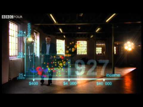
Hans Rosling's 200 Countries, 200 Years, 4 Minutes - The Joy of Stats!
0
VoiceTube posted on 2013/03/02Ever wondered how the world has changed over the last 200 years? Hans Rosling uses amazing animated bubbles to show incredible data on life expectancy and income across 200 countries, and you'll pick up some fantastic vocabulary along the way!
Learn this video on the APP!
The VoiceTube App has more in-depth practice for videos!