Placeholder Image

Subtitles section Play video

  • Hello everyone Chris here from Spoon Graphics back with another video tutorial. I received a

  • couple of emails recently from people who found one of my old tutorials on how to create

  • a letterpress effect useful, so I thought I'd use the topic for this week's video tutorial

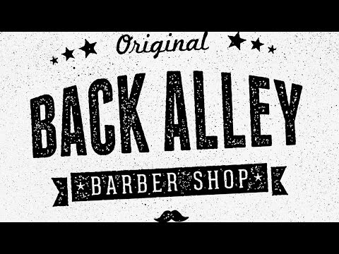
  • to update the technique. What we're aiming for is to recreate the cool

  • vintage style stamped effect you often see on logos and typographic elements, which is

  • based on old printing techniques like letterpress or simple rubber stamps. The texturing from

  • a lack of ink or the excessive ink bleed was once seen as a flaw in the printing process,

  • but now they're super trendy characteristics that designers love to recreate to distress

  • and age their digital designs.

  • Today I'll show you some techniques to produce ink stamp or letterpress style effects in

  • both Photoshop and Illustrator. Both apps have their pros and cons; Photoshop is much

  • more powerful when it comes to working with textures, but the results will always be in

  • raster format. Whereas in Illustrator we can have our work in 100% vector, but the effect

  • isn't quite as good.

  • Let's start with the Photoshop technique. Open up your logo or typographic illustration

  • and apply a Layer Mask so we can non-destructively erase away portions of the design.

  • There's two techniques you can use; textures and brushes. Let's look at the texture option

  • first:

  • Copy a cool texture from the web, like this spray paint image from Texture Fabrik. ALT+click

  • the Layer Mask thumbnail in the Layers panel to modify its contents. Paste in the texture,

  • then go to Edit > Adjustments > Levels and move the sliders inwards to boost contrast.

  • Click on an empty area of the canvas to exit out of mask mode. Masks work by erasing the

  • black areas of the mask from the design, so you might have to press CMD+I to invert the

  • mask contents to get a better result.

  • Alternatively, you use Photoshop Brushes to manually apply the texturing. Download and

  • install a set of subtle noise brushes. I'm afraid I can't remember where these specific

  • brushes I'm using are from. The brush names don't offer any clues, but you can find some

  • good freebies on the web. Dab with the brush in the layer mask to apply

  • an even texture all over the logo.

  • Real ink stamps never have clean and crisp edges like our digital, the ink bleeds and

  • distorts the outline. We can replicate this is Photoshop with the Ripple filter.

  • First, turn the logo into a Smart Object by right clicking the layer and select Convert

  • to Smart Object. This will prevent the Ripple from being applied permanently, so you can

  • alter the settings or remove it altogether should you want to.

  • Go to Filter > Distort and select Ripple. Change the size to Large, then adjust the

  • percentage to apply a subtle outline distortion. 20-25% should do it.

  • The effect is looking good, but there's one extra step that helps achieve that realistic

  • stamped look. Adding a black inner glow will fade out the texturing around the edges, but

  • since we've already got a layer mask applied, we need to add this effect on a new layer,

  • otherwise the mask would erase away the glow effect too and it just wouldn't work.

  • Duplicate the logo layer, then delete the Layer Mask. Move the Fill slider to 0%, then

  • double click the layer to edit the Layer Styles. Add an Inner Glow effect and change the settings

  • to Normal, Black, 100% opacity, zero choke then alter the size to generate a subtle outline.

  • That wraps up the letterpress effect in Photoshop, so let's move on to Illustrator and see how

  • a similar effect can be created in vector format. You can then choose the one that best

  • suits the project you're working on.

  • There's two ways to add the texture in Illustrator; using masks, or permanently with the Pathfinder.

  • Let's cover the mask technique first, which is essentially the same process as Photoshop,

  • but with different menu names.

  • Open the Transparency panel and click the Make Mask button. Click on the thumbnail on

  • the right to enter into mask mode, which is where you can paste in your textures. Now,

  • you could use the same image based textures as you would in Photoshop, but that defeats

  • the purpose of using Illustrator because the texturing effect would be entirely raster

  • pixel based.

  • To reap the full benefit of Illustrator's vector nature, use a vector texture like my

  • free vector Dust & Scratches textures pack. Paste a texture into the mask and rotate

  • and scale it to cover the artwork. You can build up as many layers of texturing as you

  • want to achieve the best result. Make sure the textures are filled with black so they

  • erase the artwork.

  • Click the thumbnail on the left to exit out of mask mode to see the full effect.

  • We can also apply the equivalent of the Ripple filter to achieve the ink bleed look. In Illustrator

  • it's called the Roughen effect, but it's easier to scale up your artwork first because it

  • requires such fine adjustments.

  • Go to Effect > Distort & Transform > Roughen. Check the Absolute and Smooth options, then

  • adjust the size to something really like small 0.2mm. Alter the detail amount to around a

  • third of the way up the scale to maintain a recognisable outline of your logo design.

  • Once you're happy with the result, scale your logo back down in size. Because we're dealing

  • with vectors, this scaling up and down doesn't affect the quality whatsoever.

  • If you want to permanently apply a texturing effect, instead of adding the texture to a

  • mask, you could punch out the shapes with the Pathfinder.

  • Make sure both your texture and your logo are two separate compound paths, otherwise

  • the Pathfinder can easily get upset and throw up an error. Use the shortcut CMD+8, or go

  • to Object > Compound Path > Make while all the elements are selected.

  • Place the texture over the logo, then hit the Minus Front option from the Pathfinder

  • panel. Sit back while your computer's CPU is overloaded with thousands of vector calculations.

  • The Photoshop version of this technique looks much better, but at least this Illustrator

  • method is 100% vector so you don't have to worry about scaling issues.

  • There's one more technique I want to show you that actually works in both Photoshop

  • and Illustrator. This one makes use of built in filters and effects, rather than external

  • texture files and it generates a really cool generic stamp effect.

  • In a new Photoshop document, make your logo a Smart Object so it can be edited later.

  • Apply the ripple effect as described earlier in the video.

  • Go to Image > Adjustments > Levels, then alter the Output levels to give the logo a grey

  • fill.

  • Next, add a Stroke layer style using the settings 13px, Normal, Inside and black as the stroke

  • colour.

  • Under Filter > Pixelate, select Mezzotint and change the drop down menu to Grainy Dots.

  • Next, go to Filter > Filter Gallery. Under the Sketch heading, select Stamp, then adjust

  • the settings to 1 for Light/Dark Balance and 4 for Smoothness.

  • The result is a stylized stamp effect without the tiny details of a real texture, which

  • works much better for logos when they're displayed at small sizes.

  • Illustrator also has these same filters built in. Unfortunately they don't produce the effect

  • in vector format, so when creating your document make sure the Raster Effects option under

  • the Advanced menu is set to 300ppi.

  • First, apply the Roughen effect that I explained earlier, then give your logo a grey fill.

  • Go to Effect > Stylize > Inner Glow. Set the colour to black, the mode to Normal, the opacity

  • to 100% then the blur to around 2mm.

  • Under the Effect menu, you can find the same Photoshop Filters at the bottom. Select Mezzotint

  • from under the Pixelate heading, then select Grainy Dots.

  • Head back to Filter > Sketch > Stamp and enter the same settings of 1 for Light/Dark Balance

  • and 4 for Smoothness as in Photoshop.

  • We're now at the same stage we were at in Photoshop, except there's one more feature

  • of Illustrator we can make use of...

  • Go to Object > Expand Appearance to apply these effects, then open the Image Trace panel

  • from the Window menu.

  • Turn off the Snap Curves to Lines option, turn on Ignore White, reduce the Noise slider

  • to 1. Set the Paths option to 100%, then go to Object > Expand.

  • This cool stamp effect is now 100% vector based and can be scaled to any size. This

  • technique benefits from the best of both Photoshop and Illustrator methods. It retains that vector

  • goodness, but also looks great too, unlike that first Illustrator masking technique that

  • didn't look quite as good as what was achievable in Photoshop.

  • So I hope this bunch of tips helped you out. If you enjoyed the video or learned anything

  • new I'd really appreciate some help to spread the word, either a Like on YouTube or a share

  • on Twitter or Facebook would be fantastic. If you want to stick around for more be sure

  • to hit the subscribe button, otherwise thanks for watching and I'll see you in the next

  • one!

Hello everyone Chris here from Spoon Graphics back with another video tutorial. I received a

Subtitles and vocabulary

Click the word to look it up Click the word to find further inforamtion about it