
animate
US /ˈænəˌmet/
UK /'ænɪmeɪt/
- Transitive Verb
- To give life, energy, or motion to something
B2Moreanimation
US /ˌænəˈmeʃən/
UK /ˌænɪˈmeɪʃn/
- Uncountable Noun
- The process of creating moving images using drawings, computer graphics, or other techniques.
- Liveliness or energy in behavior or expression.
B2Moreapproach
US /əˈprəʊtʃ/
UK /ə'prəʊtʃ/
- Verb (Transitive/Intransitive)
- To get close to reaching something or somewhere
- To request someone to do something specific
- Noun (Countable/Uncountable)
- Means of reaching a place, often a road or path
- Request of someone with a specific goal in mind
A2TOEICMoreback into
US /bæk ˈɪntu/
UK /bæk ˈɪntuː/
- Phrasal Verb
- To drive a vehicle backwards into a space or area.
- To accidentally collide with something while moving backwards.
A1Moreblur
US /blɚ/
UK /blɜ:(r)/
- Transitive Verb
- To make something unclear or out of focus
- To dull the distinction between things
B2Morebolt
US /boʊlt/
UK /bəʊlt/
- Noun
- Line of electricity in the sky from lightning
- Piece of metal for joining two things together
- Transitive Verb
- To lock by putting a piece of metal across a door
B1TOEICMorebunch
US /bʌntʃ/
UK /bʌntʃ/
- Noun (Countable/Uncountable)
- A group of things of the same kind
- A group of people.
- Transitive Verb
- To group people or things closely together
B1Morecarol
US /ˈkærəl/
UK /'kærəl/
- Noun
- Traditional song sung at Christmas
B2Morechase
US /tʃes/
UK /tʃeɪs/
- Noun (Countable/Uncountable)
- Act of going after someone to catch them
- Something that one pursues or tries to obtain.
- Transitive Verb
- To go after with the intention of catching
- To try very hard to get something that you want
A2Morecome up
US /kʌm ʌp/
UK /kʌm ʌp/
- Phrasal Verb
- To come closer to someone; approach
- (Of sun) to rise into the sky in the morning
A1Moreconcept
US /ˈkɑnˌsɛpt/
UK /'kɒnsept/
- Noun (Countable/Uncountable)
- Abstract idea of something or how it works
- A plan or intention; a conception.
A2TOEICMorecraft
US /kræft/
UK /krɑ:ft/
- Transitive Verb
- To make by hand and with much skill
- Noun (Countable/Uncountable)
- Job requiring a worker to have specific skills
- Vehicle that travels on water or through the air
B1Moredatum
US /ˈdetəm, ˈdætəm, ˈdɑtəm/
UK /ˈdeɪtəm/
- Noun
- Item of factual information
B1Morededicated
US /ˈdɛdɪˌketɪd/
UK /'dedɪkeɪtɪd/
- Transitive Verb
- To state a person's name in book, song, in respect
- To give your energy, time, etc. completely
- Adjective
- Devoted to a task or purpose; having single-minded loyalty or integrity.
- Designed for or devoted to a specific purpose or task.
B1Moredepth
US /dɛpθ/
UK /depθ/
- Noun
- Distance below a surface
A2Moreessentially
US /ɪˈsenʃəli/
UK /ɪˈsenʃəli/
- Adverb
- Basically; (said when stating the basic facts)
- Used to emphasize the basic truth or fact of a situation.
A2Morefantastic
US /fænˈtæstɪk/
UK /fænˈtæstɪk/
- Adjective
- Strange or unusual in design or appearance
- Very large, fast or great
A2Morefeature
US /ˈfitʃɚ/
UK /'fi:tʃə(r)/
- Noun (Countable/Uncountable)
- Special report in a magazine or paper
- Distinctive or important point of something
- Transitive Verb
- To highlight or give special importance to
- To give prominence to; to present or promote as a special or important item.
A2TOEICMorefeel like
US
UK
- Intransitive Verb
- To have a desire or inclination for something.
- To have a particular quality or sensation; resemble.
A1Morefilm
US /fɪlm/
UK /fɪlm/
- Noun (Countable/Uncountable)
- Thin layer that covers something
- Movie
- Transitive Verb
- To record moving action with a camera
A2Morefor example
US
UK
- Phrase
- As an illustration or instance.
geometry
US /dʒiˈɑ:mətri/
UK /dʒiˈɒmətri/
- Uncountable Noun
- Mathematical study of shapes, surfaces, and space
- Mathematical shape of something
B2Moregot to
US /ɡɑt tu/
UK /gɔt tu:/
- Verb (Transitive/Intransitive)
- To arrive at some place
- To have the opportunity or permission to do something
- Phrasal Verb
- To appeal to the emotions of; move
- To finally begin to start something after a delay
A1Moregross
US /ɡros/
UK /ɡrəʊs/
- Noun (Countable/Uncountable)
- 144 of something; twelve dozen of something
- Total sum of money earned before costs and taxes
- Transitive Verb
- To earn an amount of money before costs and taxes
B1TOEICMorehatch
US /hætʃ/
UK /hætʃ/
- Intransitive Verb
- To be born or come out from an egg
- Verb (Transitive/Intransitive)
- To be born or come out from an egg
B1Moreilluminate
US /ɪˈluməˌnet/
UK /ɪˈlu:mɪneɪt/
- Transitive Verb
- To supply light to something
- To make something easier to understand
B1Morein terms of
US
UK
- Phrase
- With regard to; concerning a particular aspect.
A1Moreincredible
US /ɪnˈkrɛdəbəl/
UK /ɪnˈkredəbl/
- Adjective
- Very good; amazing
- Really good; amazing; great
A2TOEICMoreinstead of
US /ɪnˈstɛd ʌv/
UK /inˈsted ɔv/
- Preposition
- When one thing is replaced by another
- Adverb
- As a substitute or alternative.
A1Morelean
US /lin/
UK /li:n/
- Verb (Transitive/Intransitive)
- To balance against or on something for support
- To have a tendency to do something; favor
- Adjective
- Having a low fat content
- Efficient; well-designed with no waste
A2Morelollipop
US /ˈlɑliˌpɑp/
UK /ˈlɔli:ˌpɔp/
- Countable Noun
- Candy on a stick
- A sign on a pole used by school crossing guards to stop traffic.
B2Morelook at
US /lʊk æt/
UK /luk æt/
- Phrasal Verb
- To use your eyes to focus on something
- To focus your eyes on something carefully
A1Morelook into
US /lʊk ˈɪntu/
UK /luk ˈɪntuː/
- Phrasal Verb
- To investigate or try to discover the reasons for
A1Morelooking out
US
UK
- Phrasal Verb
- To take care and watch something carefully
- To be careful; to be vigilant
- Intransitive Verb
- To be careful or vigilant
A1Moremarker
US /ˈmɑ:rkə(r)/
UK /ˈmɑ:kə(r)/
- Noun (Countable/Uncountable)
- Something that is easy to recognize or identify
- Thick pen used for writing, e.g. on boards
B1Moremimic
US /ˈmɪmɪk/
UK /'mɪmɪk/
- Countable Noun
- Someone who tries to act like another person
- Transitive Verb
- To copy a person's words/actions to amuse people
B2Moreout of focus
US
UK
- Adjective
- Not clear or sharp in appearance; blurry.
- Unable to concentrate or pay attention.
A1Morepeep
US /pip/
UK /pi:p/
- Intransitive Verb
- To look at secretly or when you shouldn't
- Noun
- Word or sound (used in the negative, etc.)
B2Morephysically
US /ˈfɪzɪkəlɪ/
UK /'fɪzɪklɪ/
- Adverb
- In a manner related to the body
- Concerning reality or the laws of nature
A2Morerealistic
US /ˌriəˈlɪstɪk/
UK /ˌri:əˈlɪstɪk/
- Adjective
- Looks or appears real; like things really are
- Having or showing a practical awareness of things as they are
A2Moreredefine
US /ˌriːdɪˈfaɪn/
UK /ˌri:dɪˈfaɪn/
- Transitive Verb
- To give a new explanation of or reason for
- To set or mark the limits of something again
B1Morerender
US /ˈrɛndɚ/
UK /ˈrendə(r)/
- Transitive Verb
- To cause to be in a certain state or condition
- To digitally make an image ready for use
- Noun (Countable/Uncountable)
- A first coat of plaster applied to a surface.
B1TOEICMoresequence
US /ˈsikwəns, -ˌkwɛns/
UK /'si:kwəns/
- Noun
- Part of a movie showing one part of the story
- A particular order in which related events, movements, or things follow each other.
- Transitive Verb
- To arrange things in an order they should happen
A2TOEICMoresketchy
US /ˈskɛtʃi/
UK /ˈsketʃi/
- Adjective
- Lacking detail or being incomplete
- Seeming bad, risky or dangerous
C2TOEICMorespider
US /ˈspaɪdɚ/
UK /ˈspaɪdə(r)/
- Noun (Countable/Uncountable)
- Small creature with 8 legs that spins cobwebs
B1Morestump
US /stʌmp/
UK /stʌmp/
- Intransitive Verb
- To campaign by making political speeches
- Transitive Verb
- To be too difficult for; baffle or perplex
B2TOEICMoretexture
US /ˈtɛkstʃɚ/
UK /ˈtekstʃə(r)/
- Noun (Countable/Uncountable)
- Quality from different elements, as in music
- Look and feel of a substance or material
- Transitive Verb
- To give a particular look or feel to a surface
B1Moretrailer
US /ˈtrelɚ/
UK /'treɪlə(r)/
- Noun (Countable/Uncountable)
- Advertisement of short scenes from a movie
- Vehicle pulled by a truck/car to transport things
C2Moretrend
US /trɛnd/
UK /trend/
- Noun (Countable/Uncountable)
- Current style or fashion
- General direction that is taken
- Intransitive Verb
- To be current and popular
- To move up or down
A2Moretried and true
US
UK
- Adjective
- Proven to be reliable or effective.
A2Moretweak
US /twik/
UK /twi:k/
- Transitive Verb
- To make a small change or adjustment
- To pinch or pull (something) sharply.
- Countable Noun
- A small change or adjustment
C1Moreupcoming
US /ˈʌpˌkʌmɪŋ/
UK /ˈʌpkʌmɪŋ/
- Adjective
- Occurring soon; approaching
C1TOEICMoreverse
US /vɚs/
UK /vɜ:s/
- Noun (Countable/Uncountable)
- Writing with words that rhyme or are rhythmic
- A section of writing, e.g. from the Bible
B1Morevisual
US /ˈvɪʒuəl/
UK /'vɪʒʊəl/
- Adjective
- Of or relating to vision
- Noun
- Pictures/images used to help audience understand
- A picture, map, piece of film, or other visual representation.
A2Morewhatnot
US /ˈwɑːt.nɑːt/
UK /ˈwɒt.nɒt/
- Noun
- Miscellaneous curios
- Uncountable Noun
- And other similar things
C1More
Vocabulary
- out of focus: Not clear or sharp in appearance; blurry.
- instead of: When one thing is replaced by another
- feel like: To have a desire or inclination for something.
- look at: To use your eyes to focus on something
- got to: To arrive at some place
- come up: To come closer to someone; approach
- tried and true: Proven to be reliable or effective.
- back into: To drive a vehicle backwards into a space or area.
- look into: To investigate or try to discover the reasons for
- for example: As an illustration or instance.
- in terms of
- looking out: To take care and watch something carefully
- sort: To organize things by putting them into groups
- essentially: Basically; (said when stating the basic facts)
- approach: To get close to reaching something or somewhere
- incredible: Very good; amazing
- bunch: A group of things of the same kind
- dedicated: To state a person's name in book, song, in respect
- gross: 144 of something; twelve dozen of something
- concept: Abstract idea of something or how it works
- texture: Quality from different elements, as in music
- feature: Special report in a magazine or paper
- mimic: Someone who tries to act like another person
- exist: To be present, alive or real
- lean: To balance against or on something for support
- realistic: Looks or appears real; like things really are
- fantastic: Strange or unusual in design or appearance
- physically: In a manner related to the body
- craft: To make by hand and with much skill
- sequence: Part of a movie showing one part of the story
- chase: Act of going after someone to catch them
- apply: To spread a substance or liquid over a surface
- render: To cause to be in a certain state or condition
- create: To make, cause, or bring into existence
- film: Thin layer that covers something
- visual: Of or relating to vision
- trend: Current style or fashion
- depth: Distance below a surface
- animation: The process of creating moving images using drawings, computer graphics, or other techniques.
- receive: To get something someone has given or sent to you
- lot: What happens to a person in life from chance; fate
- kind: In a caring and helpful manner
- trailer: Advertisement of short scenes from a movie
- animate: To give life, energy, or motion to something
- tweak: To make a small change or adjustment
- blur: To make something unclear or out of focus
- pull: Act of breathing in smoke, as from a pipe
- hatch: To be born or come out from an egg
- illuminate: To supply light to something
- stump: To campaign by making political speeches
- bolt: Line of electricity in the sky from lightning
- world: All the humans, events, activities on the earth
- real: Actually existing or happening, not imagined
- sketchy: Lacking detail or being incomplete
- feel: To be aware of or experience an emotion, sensation
- upcoming: Occurring soon; approaching
- work: The product of some artistic or literary endeavor
- want: To desire or wish for something; hope for a thing
- light: To cause something to burn; put a burning match to
- verse: Writing with words that rhyme or are rhythmic
- happen: To take place or occur
- geometry: Mathematical study of shapes, surfaces, and space
- datum: Item of factual information
- redefine: To give a new explanation of or reason for
- whatnot: Miscellaneous curios
- carol: Traditional song sung at Christmas
- peep: To look at secretly or when you shouldn't
- lollipop: Candy on a stick
- marker: Something that is easy to recognize or identify
- spider: Small creature with 8 legs that spins cobwebs
Get the full experience in the app
Learn anywhere with detailed sentence and usage analysis
01:03
She took a brave step forward, leaving behind her comfort zone to chase her dreams.
Vocabulary
- brave
adj. Having courage
- comfort zone
phr. A familiar situation where one feels safe
Explanation
a brave step is a noun phrase, where brave is an adjective modifying the noun step, meaning "a courageous step".
forward is an adverb modifying step, meaning "ahead".
The whole phrase serves as the object, answering the "what" of took (verb) — she took a brave step forward.
Get the full experience in the app
Look up words anytime with pronunciation, part of speech, and usage
brave
US/brev/
UK/breɪv/
adj.Brave
v.t.To bravely face
A2 Elementary
Get the full experience in the app
Practice speaking anytime and get instant pronunciation feedback
Try this speaking exercise.
Try practicing with this sentence.
80
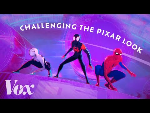
How "Spider-Verse" forced animation to evolve
0
林宜悉 posted on 2022/10/18Ever wondered how movies like "Spider-Verse" create such unique, comic-book looks? This video dives deep into the animation techniques and custom shaders that pushed the industry forward, and you'll pick up some awesome advanced vocabulary along the way!
Learn this video on the APP!
The VoiceTube App has more in-depth practice for videos!