
abstract
US /ˈæbˌstrækt/
UK /'æbstrækt/
- Noun (Countable/Uncountable)
- Passage of text from an article or book
- Something that doesn't exist physically
- Adjective
- Concerning something that doesn't exist physically
- Relating to abstract art.
B1Moreadobe
US /əˈdoʊbi/
UK /əˈdəʊbi/
- Noun (Countable/Uncountable)
- Type of sun-dried brick made of straw and clay
- A building made of adobe.
- Adjective
- Of a light yellowish-brown color.
C1Moreall the rage
US
UK
- Phrase
- Being the current popular thing
B1Moreaugment
US /ɔɡˈmɛnt/
UK /ɔ:ɡ'ment/
- Transitive Verb
- To make something larger, stronger, more effective
B2TOEICMorecombine
US /kəmˈbaɪn/
UK /kəmˈbaɪn/
- Verb (Transitive/Intransitive)
- To mix several things together to form one thing
- To harvest by means of a combine.
- Noun (Countable/Uncountable)
- A harvesting machine for cutting, threshing, and cleaning grain.
- A mixture of different things.
A2Morecomfortable
US /ˈkʌmfətəbəl, ˈkʌmftəbəl/
UK /ˈkʌmftəbl/
- Adjective
- Having more than enough e.g. money for your needs
- Being relaxed, warm or happy
A2Moreconserve
US /kənˈsɜ:rv/
UK /kənˈsɜ:v/
- Transitive Verb
- To save or protect something
- To keep or put in reserve
- Uncountable Noun
- The act of conserving something, especially a natural resource.
B1Morecount
US /kaʊnt/
UK /kaʊnt/
- Verb (Transitive/Intransitive)
- To add things together to find the total number
- To matter or be important
- Countable Noun
- Number of things added together, e.g. votes
- With the number of crimes, knockouts, as stated
A2Moredepth
US /dɛpθ/
UK /depθ/
- Noun
- Distance below a surface
A2Moredevice
US /dɪˈvaɪs/
UK /dɪˈvaɪs/
- Noun (Countable/Uncountable)
- Object, machine, or equipment for a specific use
- Method of doing something; a way
A2TOEICMoredrag
US /dræɡ/
UK /dræɡ/
- Transitive Verb
- To reluctantly move or go somewhere
- To pull something heavy or difficult along the ground
- Noun (Countable/Uncountable)
- Force of air pushing back against a plane car etc.
- Boring or annoying thing/activity
A2Moreexcessive
US /ɪkˈsɛsɪv/
UK /ɪkˈsesɪv/
- Adjective
- Beyond what is usual or proper
B2Moreexpand
US /ɪkˈspænd/
UK /ɪk'spænd/
- Verb (Transitive/Intransitive)
- To make something larger in size, number, amount
A2TOEICMorefake
US /fek/
UK /feɪk/
- Adjective
- Not real; made to look like something real
- Countable Noun
- A copy of something made to trick people
B1Morefeedback
US /ˈfidˌbæk/
UK /ˈfi:dbæk/
- Noun (Countable/Uncountable)
- A response or opinion, about a service, etc.
- Information about reactions to a product, a person's performance of a task, etc. which is used as a basis for improvement.
- Verb (Transitive/Intransitive)
- To give information or opinions about something to someone, especially in order to improve it.
B1TOEICMorefeel like
US
UK
- Intransitive Verb
- To have a desire or inclination for something.
- To have a particular quality or sensation; resemble.
A1Moreflat
US /flæt/
UK /flæt/
- Noun (Countable/Uncountable)
- Apartment; set of rooms for living in
- The smooth or level part of something
- Verb (Transitive/Intransitive)
- To share an apartment with someone
- To fail to produce the intended effect; to be unsuccessful or uninteresting.
A2Morefloppy
US /ˈflɑ:pi/
UK /ˈflɒpi/
- Adjective
- Being soft and able to be bent easily
- Countable Noun
- Magnetic computer disks used in the 1980s to 1990s
C2Morefor now
US /fɔr naʊ/
UK /fɔ: nau/
- Phrase
- Temporarily; for the present time.
- In the short term; for the immediate future.
A1Morefor the most part
US
UK
- Phrase
- Generally; mostly; on the whole.
- Mostly; generally; in most cases.
A1Moreglossy
US /ˈɡlɔsi, ˈɡlɑsi/
UK /'ɡlɒsɪ/
- Adjective
- Smooth and shiny
B2TOEICMoregrocery
US /'ɡroʊsərɪ/
UK /'ɡrəʊsərɪ/
- Uncountable Noun
- Daily foods such as flour, sugar, and tinned foods
- Countable Noun
- A store that sells food and household supplies.
B2TOEICMorehave to
US /hæv tu/
UK /ˈhæv tə/
- Auxiliary Verb
- Must do
A1Moreicon
US /ˈaɪˌkɑn/
UK /'aɪkɒn/
- Noun (Countable/Uncountable)
- Small image on a computer screen
- Person widely recognized as a symbol of something
B1Morein real life
US /ɪn ˈriəl laɪf/
UK /in riəl laif/
- Phrase
- In the physical world; not online or in a fictional setting.
- Actually; genuinely; not made up or fictional.
A2Morein the future
US /ɪn ði ˈfjutʃɚ/
UK /in ðə ˈfju:tʃə/
- Phrase
- At a later time; in times to come.
A1Moreinterface
US /ˈɪntərfeɪs/
UK /ˈɪntəfeɪs/
- Noun
- Place where things come together to communicate
- Verb (Transitive/Intransitive)
- To make two different elements interact
B1Moreintuitive
US /ɪnˈtuɪtɪv, -ˈtju-/
UK /ɪnˈtju:ɪtɪv/
- Adjective
- Able to understand by feeling rather than fact
- Easy to use and understand.
B2Morelimit
US /ˈlɪmɪt/
UK /'lɪmɪt/
- Noun (Countable/Uncountable)
- Point beyond which it is not possible to go
- A line or edge marking the boundary of an area.
- Transitive Verb
- To stop or prevent an increase past a point
A2TOEICMorelogo
US /ˈloˌɡo/
UK /'ləʊɡəʊ/
- Noun
- Name, symbol or picture which represents a company
B2TOEICMoremedium
US /ˈmidiəm/
UK /'mi:dɪəm/
- Noun
- Method of expressing ideas or feelings
- Something available in a middle size or condition
A2TOEICMoremid
US /mɪd/
UK /mɪd/
- Adjective
- At (or near) the middle point
B2Moremimic
US /ˈmɪmɪk/
UK /'mɪmɪk/
- Countable Noun
- Someone who tries to act like another person
- Transitive Verb
- To copy a person's words/actions to amuse people
B2Morenavigate
US /ˈnævɪˌɡet/
UK /'nævɪɡeɪt/
- Verb (Transitive/Intransitive)
- To direct (car, plane etc.) in the right direction
- To deal successfully with something complex
B2Morenotify
US /ˈnotəˌfaɪ/
UK /'nəʊtɪfaɪ/
- Transitive Verb
- To inform; to communicate specific information
B2Moreof the century
US /ʌv ðə ˈsɛnʧəri/
UK /əv ðə ˈsenʧəri/
- other
- The most notable or important in a hundred-year period.
B2Moreout there
US /aʊt ðɛr/
UK /aut ðɛə/
- Adverb
- In or to a place that is far away
- Existing in the universe
- Adjective
- Unconventional; strange; avant-garde
- Existing or available.
A1Moreovernight
US /ˈovɚˌnaɪt/
UK /ˌəʊvə'naɪt/
- Adverb
- (Becoming famous, etc.) in a short amount of time
- For or during the night
- Adjective
- Lasting or taking place during the night
- Delivered or intended to be delivered on the next day
B1Moreperceive
US /pɚˈsiv/
UK /pə'si:v/
- Transitive Verb
- To notice or become aware of something
- To think of someone or something in a certain way
B1TOEICMorepress
US /prɛs/
UK /pres/
- Noun
- Machine using pressure to shape, flatten, squeeze
- General term for TV, radio, newspapers
- Transitive Verb
- To make clothes smooth using a heated iron; iron
- To repeatedly ask someone to do something
A2TOEICMorerage
US /reɪdʒ/
UK /reɪdʒ/
- Uncountable Noun
- Strong or violent anger
- Intransitive Verb
- To act or speak with strong or violent anger
- To move violently, like a storm
B1Morerather than
US
UK
- Adverb
- More exactly; more correctly
- Preferably; instead
- Preposition
- Instead of
A1Moreresemble
US /rɪˈzɛmbəl/
UK /rɪˈzembl/
- Verb (Transitive/Intransitive)
- To be similar to in looks or manner
B1TOEICMorescene
US /sin/
UK /si:n/
- Noun
- Incident where someone behaves angrily, badly
- View that looks like a picture
A2TOEICMorescroll
US /skroʊl/
UK /skrəʊl/
- Intransitive Verb
- To move up and down a computer screen
- Verb (Transitive/Intransitive)
- To move up, down, or across a computer screen
B2Moreshift
US /ʃɪft/
UK /ʃɪft/
- Verb (Transitive/Intransitive)
- To change in position or direction
- To move something from one place to another
- Noun (Countable/Uncountable)
- A change in a persons plans, opinions or beliefs
- Period of work starting at a certain time
A2Moreshrunk
US /ʃrʌŋk/
UK /ʃrʌŋk/
- Intransitive Verb
- To become smaller
- To make or become smaller than it was before
B1Morespecifically
US /spəˈsɪfɪkli/
UK /spəˈsɪfɪkli/
- Adverb
- As regards a particular thing; closely related to
- In a definite and clear manner.
A2Moresudden
US /ˈsʌdn/
UK /ˈsʌdn/
- Adjective
- Happening or done quickly or unexpectedly
B1Moretake on
US /tek ɑn/
UK /teik ɔn/
- Phrasal Verb
- To acquire a new characteristic
- To accept a new responsibility, role
A1Moretalking about
US
UK
- Phrasal Verb
- To discuss a particular topic.
- To be constantly mentioning or bringing up a subject.
A1Moretechnology
US /tɛkˈnɑlədʒi/
UK /tek'nɒlədʒɪ/
- Uncountable Noun
- Use or knowledge of science in industry etc.
- Machinery and equipment developed from scientific knowledge.
A2TOEICMorevector
US /ˈvɛktɚ/
UK /'vektə(r)/
- Noun
- Math a quantity that has both size and direction
B2Morevirtual
US /ˈvɚtʃuəl/
UK /ˈvɜ:tʃuəl/
- Adjective
- Existing only on the internet or on a computer
- Existing only in a digital world
B1TOEICMorevital
US /'vaɪtl/
UK /'vaɪtl/
- Adjective
- Needed to support life; essential
- Full of life; energetic
B1TOEICMorewake up
US /wek ʌp/
UK /weik ʌp/
- Phrasal Verb
- To stop sleeping
- To become fully aware and alert to a situation.
A1Moreworldwide
US /ˈwɚldˈwaɪd/
UK /ˈwɜ:ldwaɪd/
- Adjective
- Spanning or extending throughout the entire world
- Adverb
- Extending or reaching throughout the whole world.
B1More
Vocabulary
- of the century: The most notable or important in a hundred-year period.
- in real life: In the physical world; not online or in a fictional setting.
- all the rage: Being the current popular thing
- have to: Must do
- for the most part: Generally; mostly; on the whole.
- rather than: More exactly; more correctly
- out there: In or to a place that is far away
- talking about: To discuss a particular topic.
- feel like: To have a desire or inclination for something.
- take on: To acquire a new characteristic
- in the future: At a later time; in times to come.
- for now: Temporarily; for the present time.
- wake up: To stop sleeping
- perceive: To notice or become aware of something
- vital: Needed to support life; essential
- realize: To become aware of or understand mentally
- grocery: Daily foods such as flour, sugar, and tinned foods
- intuitive: Able to understand by feeling rather than fact
- specifically: As regards a particular thing; closely related to
- develop: To explain something in steps and in detail
- scene: Incident where someone behaves angrily, badly
- navigate: To direct (car, plane etc.) in the right direction
- excessive: Beyond what is usual or proper
- abstract: Passage of text from an article or book
- mimic: Someone who tries to act like another person
- shift: To change in position or direction
- rage: Strong or violent anger
- flat: Apartment; set of rooms for living in
- virtual: Existing only on the internet or on a computer
- expand: To make something larger in size, number, amount
- introduce: To open an essay to set the scene
- drag: To reluctantly move or go somewhere
- click: To work well with someone or something
- device: Object, machine, or equipment for a specific use
- press: Machine using pressure to shape, flatten, squeeze
- scroll: To move up and down a computer screen
- digital: Using electronic signals or computers
- depth: Distance below a surface
- resemble: To be similar to in looks or manner
- feedback: A response or opinion, about a service, etc.
- combine: To mix several things together to form one thing
- fake: Not real; made to look like something real
- medium: Method of expressing ideas or feelings
- count: To add things together to find the total number
- lot: What happens to a person in life from chance; fate
- limit: Point beyond which it is not possible to go
- century: Period of 100 years
- technology: Use or knowledge of science in industry etc.
- comfortable: Having more than enough e.g. money for your needs
- operate: To control or handle something, such as a machine
- simple: Not hard to understand or do; not complex
- worldwide: Spanning or extending throughout the entire world
- argue: To fight or disagree over something
- conserve: To save or protect something
- sudden: Happening or done quickly or unexpectedly
- turn: To become (a particular age)
- change: To exchange one set of clothes for another
- land: Region or country
- space: Empty area kept for a specific reason, like a car
- icon: Small image on a computer screen
- start: First time or place that a thing exists; beginning
- overnight: (Becoming famous, etc.) in a short amount of time
- glossy: Smooth and shiny
- augment: To make something larger, stronger, more effective
- shrunk: To become smaller
- interface: Place where things come together to communicate
- floppy: Being soft and able to be bent easily
- notify: To inform; to communicate specific information
- mid: At (or near) the middle point
- vector: Math a quantity that has both size and direction
- logo: Name, symbol or picture which represents a company
- adobe: Type of sun-dried brick made of straw and clay
Get the full experience in the app
Learn anywhere with detailed sentence and usage analysis
01:03
She took a brave step forward, leaving behind her comfort zone to chase her dreams.
Vocabulary
- brave
adj. Having courage
- comfort zone
phr. A familiar situation where one feels safe
Explanation
a brave step is a noun phrase, where brave is an adjective modifying the noun step, meaning "a courageous step".
forward is an adverb modifying step, meaning "ahead".
The whole phrase serves as the object, answering the "what" of took (verb) — she took a brave step forward.
Get the full experience in the app
Look up words anytime with pronunciation, part of speech, and usage
brave
US/brev/
UK/breɪv/
adj.Brave
v.t.To bravely face
A2 Elementary
Get the full experience in the app
Practice speaking anytime and get instant pronunciation feedback
Try this speaking exercise.
Try practicing with this sentence.
80
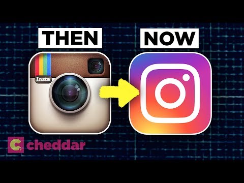
Why 3D Logos Fell Out of Favor Overnight - Cheddar Explains
0
Aniceeee posted on 2021/11/06Ever wonder why those flashy 3D logos disappeared almost overnight? This video dives into the fascinating evolution of logo design, from skeuomorphism to the minimalist flat design we see everywhere today! You'll pick up some awesome vocabulary related to design trends and tech, perfect for understanding how visual styles change.
Learn this video on the APP!
The VoiceTube App has more in-depth practice for videos!