Subtitles section Play video
-
You want to explore how revenue is affected by certain demographics. Begin
-
by creating a project and adding the first data source. Columns that contain
-
numbers are assumed to be measures such as store ID, however you need to treat
-
these columns as attributes. Review the column characteristics, hide the columns
-
you don't need, and add the data source to the project. Four data elements are now
-
hidden in the data set. Make sure that the aggregation method for units and
-
revenue is set to sum and then add the data source to the project. Switch to
-
visualize mode to begin building visualizations. Select the first data
-
element and then use the control key to select other relevant columns. Drag them
-
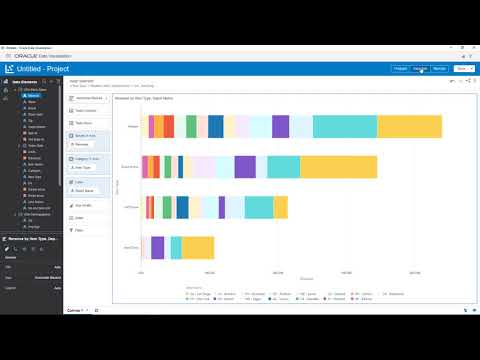
to the canvas and begin exploring the data by swapping depot name with item
-
type. By positioning the mouse over a value and using the right-click menu to
-
sort the data, you're able to view the highest values first. A marquee can be
-
created by dragging the cursor over specific values and right-clicking
-
inside the marquee area to keep only the selected values. Now that you are focused
-
on exploring the highest revenue-producing item types, you want to
-
extend the data by adding demographics. The demographic detail is in another
-
spreadsheet. Upload the demographics details and switch back to visualize
-
mode. Next, take a look at the connections in the source diagram. A connection by
-
zip code is made with the other source automatically. Now, begin to examine the
-
impact on revenue by selecting the education demographic data element. Drag
-
average education to the trellis rows drop target.
-
It looks like the highest revenues generated are for those who have
-
achieved an education level of 15 years. You'd like to see if the revenue goals
-
were met for these item types as well. Do this by adding the target revenue
-
data source. Two connections are recommended. Review all the
-
characteristics and include a third connection that matches store sales with
-
target revenue based on dates. Verify the match and return to visualize mode. Now,
-
create a revenue calculation for the daily sales verses target revenues.
-
Double-click data elements and operators to create the expression and then
-
validate it. Both measures are from different sources.
-
Add a second visualization to explore revenue variances by copying the
-
existing visualization and selecting the location on the canvas to paste it.
-
Delete average education and depot name from the chart. Replace revenue with
-
revenue variance from the my calculations folder and item type with
-
order date. Focus the visualization on 2016 by adding a marquee and keep only
-
those values. The filter is applied to both visualizations. You notice that for
-
most of this time period, target revenues were below expectations. Now that you've
-
finished, save the project. Based on this exploration, you now have a better
-
understanding of the revenue generated for specific item types. In this video, I
-
showed you how to create a project, open and blend data sources, swap columns,
-
limit data, and create a calculation.
-
Find out more at: oracle.com/data_visualization.