Placeholder Image

Subtitles section Play video

  • Hi everyone, I am getting set to mix some flesh tones for a portrait I am working on

  • and just thought I would go ahead and record this for those who are interested. I wrote

  • a blog a little while back about mixing flesh tones and included several still shots, but

  • thought I would go ahead and do a video to make it easier to see as well. A lot of times

  • I get asked, "How do you mix flesh tones?" There are several different ways of doing

  • that but, basically, I'm going to go ahead and show you how I start out. This isn't the

  • only way to start out, of course, but it's my particular way of mixing flesh tones. And

  • each portrait is different, each painting is different so that all depends as well.

  • The portrait I'm going to be working on today is an outdoor portrait which is a very high

  • keyed portrait which means the value range is very high. So, instead of going all the

  • way down to my darkest value, I'm actually using half the scale. Basically, three-quarters

  • of the scale I would say. Instead of using my darkest dark, I'm using more of a middle

  • dark value range, using those values up, so it all depends. If I was doing an indoor portrait

  • I'd obviously mix darker values as well and darker colors. To go ahead and get started

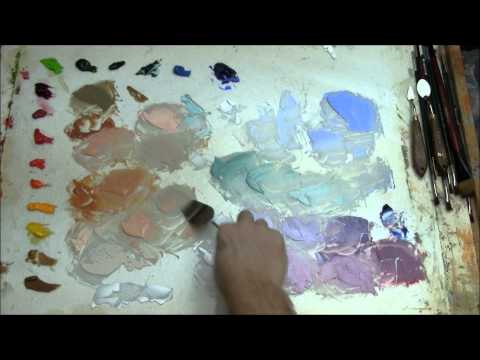
  • here, I'll show you what colors I have laid out here on my palette. These are all Winsor

  • Newton colors. What I have here is Raw Sienna, Gold Ochre, Cadmium Yellow Pale, Cadmium Yellow,

  • Cadmium Orange, Cadmium Scarlet, Cadmium Red and Cadmium Red Deep, and then Permanent Alizarin

  • Crimson, and then this color here, this sort of flourenscent green color is Cadmium Green

  • Pale. I have a Sap Green, a Prussian Green, I have Viridian, Manganese Blue Hue, and a

  • French Ultramarine Blue. And then down here for my white, I have Titanium White. The way

  • I organize my palette is based on temperature, so basically the warm colors are over here,

  • it moves from warm over to cool colors. But then also, within each of these different

  • color families I have a warm and cool version. Like a Raw Sienna is cooler than a Gold Ochre,

  • the Cadmium Yellow Pale is warmer than the Cadmium Yellow, the Cad Orange is warmer than

  • the Cad Scarlet and so forth. The reason they get cooler is because they are moving towards

  • the cooler side. So say I have a Cadmium Yellow Pale. The reason Cadmium Yellow is cooler

  • is because it has more red in it, so it gets cooler in that respect. And that's basically

  • how I lay out my palette. I don't use black on my palette, not to say that I don't use

  • black. Occasionally I will, but I use it for more of a blue, actually. If you mix an ivory

  • black with a little bit of white, you'll get a bluish tint. There's nothing wrong with

  • using black at all, John Singer Sargent used it very well and was able to incorporate it

  • into flesh tones, but he used it as more of a graying agent, as more of a bluish color.

  • But, anyway, let's start mixing colors here. Basically when I'm mixing colors, I'm using

  • some warm mixtures to start out with. I like to use a Gold Ochre and then sometimes I'll

  • mix the Gold Ochre with a Cad Scarlet and mix those two together. I'll add some white

  • to that and then basically I get a warm color to start out with which is fine because later

  • on I can add the cooler colors into it, particularity the complements. You get different values

  • here by adding different degrees of white. It's interesting to note that the more white

  • you add to a color, the cooler it actually makes that color. OK, that's Cad Scarlet and

  • I could do the same thing if I took Cad Red and mix those two together and add some of

  • that white in there and you get a slightly different version or variation because it

  • leans towards the red side, whereas the Cad Scarlet leans toward the orange side. It's

  • actually in between a Cad Orange and Cad Red. You can see the difference here if I lay them

  • side by side. This one definitely has more red in it. Anyhow, I'll move it back here

  • to keep it over in it's family. Now I'll go ahead and mix a lighter value as well. The

  • reason I put so much white on my palette here than any other color is because I go through

  • a lot of white when I mix flesh tones. Talking about palettes, this palette is actually just

  • a piece of glass that I've laid over top a piece of foam board. And basically what is

  • does is it provides me with, I prefer to start out on a white canvas, there are some artists

  • that work on a toned canvas, which means you put a light wash like a burnt umber or some

  • sort of an earth tone on there. Some people tone their canvas grey. It all depends on

  • how you work, but the way I like to work is on a blank white canvas. So by putting a white

  • piece of foam board underneath, it just gives me, allows me to judge colors a little bit

  • easier. And I've done this for so many years, I'm just used to working on a white palette.

  • Joe Bowler, an artist from Hilton Head, South Carolina, a fantastic portrait painter, got

  • me started using a glass palette back when I was in college, and I've been using one

  • ever since. Actually, this whole color scheme here, the way that I set up my palette, is

  • basically Joe Bowler's palette as well, give or take a few colors. You don't necessarily

  • need all these colors. As an artist, a lot of these are convenience colors, meaning that

  • you don't have to mix every one in order to paint. When it comes to working with color,

  • you really only need the three primary colors, a very limited palette You could do it with

  • a yellow, a red, and a blue, and then white as well, and mix a huge variety of colors

  • that way. But for me, I just like to use the extra colors. It just makes it easier for

  • me. And that's pretty much the reason why I have so many colors here. Another thing

  • that I'll mention here is that the palette knife that I'm using is a larger palette knife.

  • It has a larger trowel shaped handle which makes it easier. There are some that come

  • with a straight handle, but when you mix paint you end up with a big glob of paint near the

  • handle, so it makes sense to me to use a trowel handle. It's a good size for mixing a lot

  • of paint. So, let me go ahead and mix some more paint. I've got some warm colors to start

  • out with and then I'll introduce some of these cooler colors, too. I'll do a blue, a French

  • Ultramarine Blue, which is a beautiful blue and doesn't take a whole lot to change the

  • color when you use that French Ultramarine. We'll go with a darker value here. When I

  • talk about Value, I won't go into detail now, but value refers to different degrees of dark

  • and light that are measured on a scale from black to white. So every color has a value

  • that is automatically assigned to it whether we realize it or not. As an artist, it's very

  • important to realize that so you can work with color more effectively. Value sets the

  • stage on which color performs. In other words, color can't survive without value, everyone

  • of these colors I'm mixing has a value, whether its a lighter value or a darker value, but

  • it's going to fall somewhere on the value scale from black to white, somewhere in there.

  • The reason I use the black and white scale is just for the fact that it's easier to measure.

  • Sometimes color can trick you, especially when using reds.A lot of times when I'm judging

  • values, I notice, for myself, that reds sometimes play a trick on your eyes. Sometimes I think

  • they're lighter than they actually are. If you take a photo, or a black and white photo,

  • or convert your photo to black and white, you'll notice you get the true value relationships.

  • A lot of times that is what I'll actually do when I'm working on a portrait. If I come

  • across an area that I'm having a difficult time determining whether the values are too

  • light or too dark because I'm working in very subtle skin tones, very subtle values, I'll

  • take a picture and convert it to black and white on the computer or on the camera and

  • take a look at it just to see what the actual value is compared to the other values in the

  • painting. Anyhow, back to my demonstration here,. I tend to go off on rabbit trails quite

  • often. Also to let you know, my children just got home from school not too long ago and

  • they may barge in. If so, you'll know the reasoning behind it, but hopefully they won't.

  • So what I'm going to do is mix some French Ultramarine and what I want to do is mix a

  • little bit of Viridian as well. Viridian is a very cool green. The reason it's so cool

  • is because here you can see the Sap Green contains a lot of yellow in it. It leans toward

  • the warmer side. The further up you go, you get to Viridian which has a lot more blue

  • in it. Because there is so much blue in it, it leans more, it's a lot cooler in comparison

  • to say a Sap Green. It takes a little more Viridian though. It doesn't have the same

  • tinting strength as French Ultramarine. When I say tinting strength, I'm talking about

  • the ability to change, the ability to tint a color very quickly, meaning it takes more

  • paint, more Viridian to get the same value when you mix it to white than it would if

  • you mixed the French Ultramarine Blue with white. Let's get a little more of this white

  • over here. When I start out, I like to get a bunch of different values of warm and cooler

  • colors just so it makes it easier. It's less time consuming later on. It takes a little

  • time in the beginning, but you actually save time later on because I don't have to go back

  • and mix all these things and I can just start dipping into each one of them. The reason

  • I do the different values is because I'm trying to get similar values over here with the warmer

  • colors and get the similar values with the cooler colors as well. Then when the time

  • comes, which I'll show you in just a few minutes, when I do want to mix a couple of these colors

  • together, instead of changing the value every single time before I add it to one of these

  • values, I can add a similar value, almost the same value and just change the color without

  • changing the values, which is very important. If I wanted to add more of a bluish, more

  • of a blue to this color down here, just to kind of neutralize, kind of make more of a

  • grey color for skin tones instead of adding this dark blue. If I added this darker blue

  • into this, or even added straight Ultramarine Blue into this color here, I'm not only changing

  • the color but changing the value, which you don't want to do. When I'm painting portraits,

  • I like to find which value I need first of all, and once I determine the value, I can

  • then mix the color to match that value. I just find it easier to do that as well. I'm

  • going to take a little bit of this Ultramarine Blue and this is that Permanent Alizarin Crimson.

  • I use the Permanent Alizarin Crimson. I used to use just the regular Alizarin Crimson but

  • I guess they found out that it wasn't quite as permanent. So now they have some a Permanent

  • Alizarin Crimson. It's a little more expensive, but I'd rather use a paint that is going to

  • last, especially when it comes to a commissioned portrait, because you are creating an heirloom

  • that will be passed down from one generation to another and you want it to be able to last.

  • So what I've done here is make two different versions of this purple color. I have more

  • of a cool version, which has more Ultramarine Blue, and I have more of a warm version which

  • has more Permanent Alizarin Crimson in it. Now I can take those and I have to get some

  • more white here, but I can take those and add more white in them as well. Color is a

  • very intuitive thing. Every artist sees color differently and every artist mixes color differently

  • but it's an intuitive reaction. Whenever I'm painting and put a color down on the canvas,

  • I'm always reacting to it, whether it's too cool, too warm, whether the value is not right,

  • or just in general whether or not I get a feeling of whether or not it works. And if

  • I don't think it works, I'll go ahead and put down another color or I'll adjust the

  • color somewhat and it's that back and forth reacting to color that is very important.

  • It's not a set method every single time for each painting because every painting is different

  • and requires different color combinations. And, actually, color itself, when it comes

  • to mixing flesh tones, there is no one particular color that is going to make up flesh tones

  • or give you the illusion of skin color. When it comes to color, one of the keys to painting

  • flesh tones is the combination of colors- how you mix warm and cool colors together

  • and how you get, what I call, grays which are different mixtures of complimentary colors

  • in different degrees which I'll show you here in a minute. But you can't just have something

  • like this color for flesh tones because this is just way too warm. And you can't have something

  • that is too cool. If all the flesh tones are too cool, it will tend to look lifeless, and

  • doesn't have any life in it, so you have to strike a balance between the two. A lot of

  • times when I'm painting a portrait, the end game of a portrait is really somewhat difficult.

  • It's more than somewhat difficult. I'd say that it's one of the most difficult parts

  • of the portrait.That is one of the most difficult stages for me because it's at that last stage

  • that I'm trying to balance that color, trying to get enough warm and enough cool and enough

  • grays in there to balance each other out so that it gives the illusion of life inside

  • that skin, just like when we see flesh tones in real life there is a mixture of warm and

  • cool colors. When I talk about grays, grays happen when the form turns. Say you have a

  • light coming down on a subject and it goes around where the light meets the shadow. In

  • between there, that's usually where grays occur. For an indoor portrait, it's d