Placeholder Image

Subtitles section Play video

  • RACHEL GARB: Good afternoon.

  • Thank you so much for joining us.

  • We're really excited to be here.

  • I'm Rachel Garb, and I lead interaction design for

  • Android's apps at Google.

  • HELENA ROEBER: Hi.

  • I'm Helena Roeber, and I led Android's UX research team

  • from its beginning through 2012.

  • RACHEL GARB: Let's just jump right in, because we have a

  • lot to cover.

  • Let's start with a vision.

  • "Enchant me.

  • Simplify my life.

  • Make me amazing." If it seems a little touchy-feely, well,

  • that's intentional.

  • You see, it's about people.

  • Now of course, this is not a revelation--

  • certainly not to the people in this room.

  • Those of us in the business of creating technology for

  • people, we're well-accustomed to thinking through use cases

  • and analyzing user metrics.

  • But there's another aspect to people that may not come up as

  • much, and that's emotion.

  • We all respond emotionally to every moment we experience.

  • And according to Nobel Prize-winning scientist Daniel

  • Kahneman, we experience about 20,000 of these moments in a

  • waking day.

  • Now, we don't remember all of them, but the ones we do are

  • almost always either positive or negative.

  • Now Kahneman and other scientists are studying the

  • effects of these emotions, and here's what they're finding.

  • Negative emotions, like anger and fear and hate and shame,

  • can be harmful to your health and may even

  • shorten your lifespan.

  • Now positive emotions, on the other hand, like hope and joy

  • and love, they're an essential daily

  • requirement for survival.

  • They improve our physical and mental health, and they

  • protect us from depression and illness.

  • So as designers, every decision we make affects

  • people emotionally.

  • Now our team sees this as a huge opportunity, but also a

  • responsibility we take very seriously.

  • So about two years ago, we developed this design vision.

  • Now, you'll notice it's phrased in the first person.

  • That's intentional.

  • We want this to read not as our vision, but as the vision

  • that our users have for us.

  • Now how do we know this vision is valid?

  • Well, from all the user research we've done to date,

  • which Helena will talk about in a little bit, it really

  • boils down to these three sentences.

  • So it's a tall order.

  • What exactly does it mean to enchant me, simplify my life,

  • and make me amazing?

  • Answers can be found in Android's design principles.

  • They're based on the same research that informed our

  • vision, and they've been guiding us to create

  • beautiful, usable, and innovative designs.

  • Now, we're certain they can do the same for you, and that's

  • why we're here today.

  • So we're going to introduce you to these design principles

  • and talk about why we believe in them.

  • We'll show many examples, including from some

  • groundbreaking projects, and we'll talk about how you can

  • use them with your teams.

  • HELENA ROEBER: I will now quickly go through the

  • principles.

  • And don't worry if I'm going a little bit too fast.

  • We will later spend a lot of time on in-depth examples that

  • explain each of them.

  • The principles are grouped into the three pillars of

  • Android's vision.

  • "Enchant me" is about filling people with joy, showing them

  • beautiful visuals and graceful motions, letting them

  • customize their space, and letting them directly touch

  • objects and interact with them.

  • And here are the four design principles for "Enchant me."

  • RACHEL GARB: Delight me in surprising ways.

  • HELENA ROEBER: Real objects are more fun

  • than buttons and menus.

  • RACHEL GARB: Let me make it mine.

  • HELENA ROEBER: Get to know me.

  • The second pillar of Android's vision, "Simplify My Life," is

  • about making things easy for people, making their world

  • simple to navigate, explaining it in clear words and

  • sometimes even with pictures, and bringing attention to what

  • is essential.

  • And here are the eight principles for "Simplify My

  • Life."

  • RACHEL GARB: Keep it brief.

  • HELENA ROEBER: Pictures are faster than words.

  • RACHEL GARB: Decide for me, but let me have the final say.

  • HELENA ROEBER: Only show what I need when I need it.

  • RACHEL GARB: I should always know where I am.

  • HELENA ROEBER: Never lose my stuff.

  • RACHEL GARB: If it looks the same, it should act the same.

  • HELENA ROEBER: Only interrupt me if it's important.

  • And finally, the last pillar, "Make Me Amazing," is about

  • making people feel capable, strong, and smart, giving them

  • things that they would love to show off to their friends, and

  • making them feel like they're in charge of this powerful and

  • magical force.

  • And here are the five principles for "Make Me

  • Amazing."

  • RACHEL GARB: Give me tricks that work everywhere.

  • HELENA ROEBER: It's not my fault.

  • RACHEL GARB: Sprinkle encouragement.

  • HELENA ROEBER: Do the heavy lifting for me.

  • RACHEL GARB: Make important things fast.

  • HELENA ROEBER: Next, I'll talk a little bit about the origins

  • of the design principles, how we realized we needed them,

  • how we developed them, and the difference that they made once

  • we started to apply them.

  • During an extensive UX research project called the

  • Android Baseline Study, consisting of diaries, in-home

  • interviews, and observations, we saw the profound effect

  • that technology design had on people's lives.

  • This photo here is one of our engineers at one of the

  • in-home visits.

  • We saw when, how, and why people were using computers,

  • tablets, and mobile devices.

  • And we saw that technology had become so pervasive that

  • people had started to schedule deliberate offline times and

  • enforce them so they could spend quality time with their

  • family and friends.

  • We saw joy in people's faces when they used technology and

  • something happened that they considered magical or

  • something that brought them closer to their friends or

  • maybe something that just gave them a welcome break

  • during their day.

  • But we also saw, unfortunately, the flip side.

  • It turns out we tend to blame ourselves whenever something

  • goes wrong in technology, and we realized that all those

  • non-ideal implementations, they eroded people's

  • confidence in their own abilities and often just

  • caused sheer frustration.

  • I'm sure you have all experienced the same.

  • I certainly have experienced it myself.

  • So this was a call to Android to touch people's hearts, to

  • do more of the good stuff and to fix some of the annoyances

  • in the product.

  • So the entire Android UX team got together and started to

  • unpack what wasn't working and why, and we came

  • up with a long list.

  • And to be honest, because the team had such high aspirations

  • for their work, it was a little bit of a bummer.

  • So Rachel and I, we looked at each other, and we thought,

  • what if we turn this long list of shortcomings that bum us

  • out every time we look at it into something that actually

  • inspires us to create beautiful and usable designs?

  • So we took the long, negative list of shortcomings, and we

  • organized it.

  • We painstakingly wordsmithed and crafted it to be short,

  • memorable, and in the voice of the user.

  • Let me give you an example.

  • One of the insights from this baseline study was users are

  • overwhelmed by options and limitless flexibility.

  • So our first try at rewording this was "Don't overwhelm me

  • on the first date." So you can see, we actually have a lot of

  • fun with this.

  • But in true iterative design fashion, this was

  • not the last version.

  • So we gave it one more try, and we came up with "Only show

  • me what I need to see." And this was pretty close, but it

  • didn't have that time element that is actually really

  • important to progressive disclosure.

  • So we gave it one more try, "Only show what I need when I

  • need it," and this was a winner.

  • This is one of our design principles that we have today.

  • We started to use the design principles during Android's

  • Ice Cream Sandwich release, which is the biggest

  • qualitative jump in Android's user experience to date.

  • Two years later, they are still serving the team well.

  • What they do is they remind the team what good design is

  • all about, and they give the team a common language to talk

  • about design in terms of people.

  • And finally, they help the team to tap into people's

  • emotions and to specifically design for those emotions.

  • Many of the principles are aimed at avoiding negative

  • emotions in people.

  • For example, "Only interrupt me if it's important" prevents

  • users from feeling annoyed or angry.

  • Others are geared at triggering positive emotions.

  • "Let me make it mine" makes people feel more at home.

  • So the design principles give us designers control over the

  • emotions that our products trigger in people

  • when they use them.

  • And this is important, because from all our research, we know

  • that our mobile devices have become almost as close to us

  • as our best buddies, our partners or colleagues.

  • They wake us up in the morning.

  • They entertain us and make us productive during the day, and

  • they even tuck us into bed.

  • So it makes sense to take a closer look at research that

  • examines relationships and emotions.

  • Psychology professor John Gottman at the University of

  • Washington has done extensive research on marriage.

  • And he did this one study where he was able to predict

  • whether a couple would stay together or not after

  • observing them for only 15 minutes shortly after they got

  • their marriage license, and he was right with 94% accuracy.

  • So that's pretty cool.

  • So how did he do it?

  • So his predictions were based on a simple formula.

  • And his predictions, actually he checked back 10 years later

  • to see whether he was right.

  • So his predictions, they were based on a simple formula--

  • the ratio of positive to negative emotions.

  • He predicted that a marriage is heading toward a good

  • outcome when that ratio is close to 5 to 1.

  • And he predicted that a marriage is heading toward

  • divorce when that ratio is closer to 1 to 1.

  • Other people, like the psychologist Marcial Losada,

  • has done similar research in the workplace as director of

  • the Center for Advanced Research

  • in Ann Arbor, Michigan.

  • And he found that work groups that have a positive to

  • negative ratio of 3 to 1 are significantly more productive

  • than work groups that don't reach that ratio.

  • Another psychology professor, Barbara Frederickson, she runs

  • a lab at the University of North Carolina, Chapel Hill

  • called the PEPlab, which stands for Positive Emotions

  • and Psychophysiology.

  • She found that we need three positive emotions to lift us

  • up for every negative emotion that drags us down.

  • Does this apply to design?

  • Absolutely.

  • Think about how common it has become for people to spend

  • more time with their technology, their mobile

  • devices, and computers than with their partners.

  • And the message for designers is clear.

  • All those little annoyances in your product, they're

  • unfortunately not so little.

  • They have the power to erase all the magic

  • that you have created.

  • RACHEL GARB: Here's a way to visualize this.

  • Imagine we have two jars side by side.

  • One is a positive jar, and one is a negative jar.

  • If we trigger a positive emotion because we are

  • excelling at a design principle, we put one marble

  • in the positive jar.

  • If, on the other hand, we trigger a negative emotion

  • because we are ignoring a design principle, we put not

  • one, not two, but three marbles in that negative jar.

  • Now, once the marbles go in the jars, they

  • can't be taken out.

  • But the difference in amounts in each jar

  • can change over time.

  • If both jars have the same number of marbles, it does not

  • mean our job is done.

  • Heck, research tells us we're barely out of the doghouse.

  • And if this were a marriage, we'd be halfway to divorce.

  • So what we're really after is to fill the positive jar and

  • keep the negative jar empty.

  • HELENA ROEBER: Let me give you an example of visual motion.

  • So we all know the Android has multiple Home screens.

  • And if you reach the end of the final Home screen, this is

  • what happens.

  • The screen tilts a little bit and changes color.

  • I'll get back to that design in a little bit.

  • I'd like to just explore a couple of other ways to solve

  • that design problem of communicating that we've

  • reached the final screen.

  • What if we did nothing when we reached the final screen?

  • How would that feel?

  • I know how I would feel.

  • I would probably keep tapping it, and then eventually I'd

  • give up, thinking that I did something wrong.

  • And even though this was probably not the most

  • important event in my day, there would be

  • this nagging feeling.

  • What did I do wrong?

  • So let's see how we're doing with the design principles.

  • We missed the boat on "I should always know where I am"

  • and "It's not my fault," because I just blamed myself

  • for doing something wrong.

  • So that's not so good.

  • That's six negative marbles, and we would need six positive

  • marbles just to get kind of even.

  • Let's try something different.

  • What if, when we reach the last screen and we try to go

  • beyond it, we pop up a little message that says, "This is

  • the last screen"?

  • It turns out whenever we pop up something on screen, it's a

  • little bit like being nagged.

  • And in the worst case, it's like being shouted at, and it

  • takes us out of what we were doing.

  • And now, we have to read the words, understand them, and

  • try to decide whether we need to act on the message.

  • So how are we doing with our design principles?

  • We still get three negative marbles for "It's not my

  • fault," because I just got nagged.

  • And there's more.

  • We also get three negative marbles for "Only interrupt me

  • if it's important." So even though this design has more

  • feedback, it's not necessarily a better design.

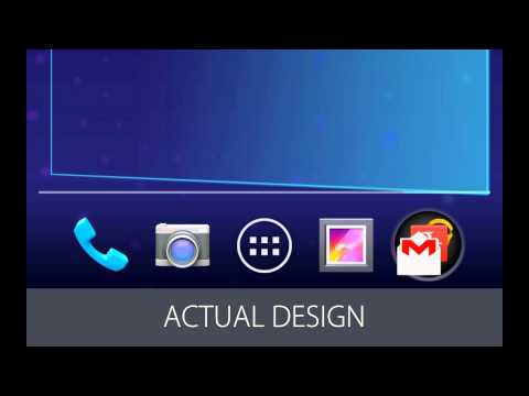
  • Let's look at the actual design.

  • When people encountered this in user studies, they just

  • kept playing with it.

  • They just really seemed to enjoy how it changes colors,

  • how kind of the physics work out.

  • And it was really clear that people enjoyed what they were

  • doing, and they enjoyed interacting with it.

  • Not only did it tell them that they did everything right, it

  • also kind of helped establish the virtual spaces.

  • And it provided this feedback in an elegant, subtle, and

  • non-disruptive way.

  • So how are we doing with the design principles?

  • So the things that were previously an issue are no

  • longer, so negative marbles.

  • Yay.

  • But we do get positive marbles for "Delight me in surprising

  • ways," because this interaction was just really

  • enjoyable, as we could see in the user studies.

  • We also get a positive marble for "Sprinkle encouragement,"

  • because we just encouraged people to interact with the

  • device through touch.

  • We get a positive marble for "Pictures are faster than

  • words," because there are no words used.

  • And we get a marble for "Give me tricks that work

  • everywhere," because this is a pattern that is applied

  • throughout the platform.

  • So if you work in design, you know that creating a beautiful

  • and graceful animation like that is not simple.

  • And our motion and visual designers, they spent many

  • iterations to get this interaction just right.

  • RACHEL GARB: OK.

  • [APPLAUSE]

  • RACHEL GARB: A segue to another topic, words.

  • So one of the principles that Helena just mentioned was that

  • "Pictures are faster than words." Now, to be clear, the

  • principle is not saying that we should never use words.

  • Of course, there are many things that words can say that

  • pictures can't.

  • But the wrong words can really backfire.

  • So some error messages, they just scream at us, right?

  • They talk down to us, make us feel like idiots.

  • And some welcome messages when you open up a new app, boy,

  • they try way too hard to impress us.

  • They act a little too chummy, or maybe they

  • ramble on and on.

  • When it comes to shaping emotions,

  • words are truly powerful.

  • That's why the Android design team has a dedicated writer,

  • and he's taught us to pay attention in particular to

  • these three principles when we write--

  • "Keep it brief," "It's not my fault," and "Sprinkle

  • encouragement."

  • Let's look at a few examples of each of these.

  • So say the user has just signed in to their new Android

  • device, but they have to wait a moment because we're

  • connecting with Google servers to authenticate the account.

  • Now, we could say it like this or like this.

  • Here, we're describing only what's necessary and nothing

  • more, and we've eliminated redundancy.

  • And that's an example of "Keep it brief."

  • Another way we keep it brief is to help people skim by

  • putting the most important thing first.

  • That way users get a taste of the main idea right away.

  • So if Larry Page is your best friend, that's more important

  • than the 76 other people.

  • "Keep it brief."

  • Next example.

  • There was a time, admittedly, when we had a setting with

  • this label.

  • And I cringe just seeing it now.

  • But we've changed it, and now it says this.

  • Much cleaner, right?

  • [LAUGHTER]

  • RACHEL GARB: When we write for the UI, we like to pretend

  • that we're talking to someone who is smart and competent but

  • may not speak the language very well.

  • So we use short words, active verbs, and common nouns.

  • And we avoid technical jargon.

  • It makes people feel like they're not smart enough to

  • use our products.

  • This is an example of "It's not my fault."

  • And speaking of "It's not my fault," here's an example of

  • what not to say in an error message.

  • Even if the user could have prevented the situation from

  • happening, we never point it out, and we

  • certainly don't shout.

  • So here's a better way that doesn't even feel like an

  • error message anymore.

  • "It's not my fault."

  • OK, another example.

  • We have a feature in Android called Face Unlock that keeps

  • your device secure with facial recognition.

  • Now, if a face isn't recognized for whatever

  • reason, we need to display a message.

  • Now, we could say it like this.

  • It's direct, but it's a little off-putting.

  • Or maybe inject some humor.

  • But here's how we actually say it.

  • We talk directly to the reader using second person with

  • contractions, just like we do in casual conversation.

  • Now, by using a tone that's human and approachable, we are

  • sprinkling encouragement in the form of words.

  • Now what about humor?

  • Well, for some products and brands, it's perfectly

  • acceptable--

  • maybe even expected.

  • But Android's an operating system.

  • Our voice has to fit with a very wide variety of

  • situations and people, and that makes humor a more risky

  • proposition.

  • Now while we strive to be friendly, we don't go

  • overboard with being polite, because too much "hello" and

  • "please" and "thank you" everywhere can get to a point

  • where it really exhausts the reader.

  • So go for just a sprinkle of encouragement.

  • So to avoid negative emotions, we write with these three

  • principles in mind.

  • But even ahead of that, we ask ourselves, do we need to write

  • anything in the first place?

  • Now we already talked about looking for ways

  • to say it in pictures.

  • Here's something else we do.

  • If we're thinking about having a dialogue that asks "Are you

  • sure?" we'll just do it and then offer a way to undo.

  • And that's our principle "Decide for me, but let me

  • have the final say." Oh, and by the way, our team has

  • banned the use of the phrase "Are you sure?" because it

  • places blame on the user by presuming that they didn't

  • think something through.

  • So again, "It's not my fault."

  • Now, I want to switch topics and show you an example of how

  • principles influenced a feature called Android Beam.

  • Does everybody know what that is?

  • OK.

  • Well, for those who haven't heard of it, I'll just give

  • you a quick background.

  • We released this in Ice Cream Sandwich.

  • It lets you quickly share information with someone else

  • simply by touching your devices together.

  • It's really great for sharing web pages, YouTube videos,

  • photos, contact info, things like that, and it's one of the

  • Android projects that I'm most proud to have worked on.

  • We designed it with the future in mind-- a future where

  • everyone's Android devices could beam and every app

  • developer does something useful or cool with it.

  • Now let's say I want to share this picture of

  • Lulubelle with Helena.

  • We just bring our devices together, and that puts us

  • directly into a mode for sharing.

  • I don't have to choose anything from a menu.

  • But you may be wondering, what if I didn't know Helena, and

  • we're crowded together on a subway, and our phones are in

  • our pockets?

  • Could I accidentally pocket beam that photo?

  • And at the same time, could Helena accidentally send

  • something to me that she didn't want to?

  • Well, the answer is no.

  • Because once the devices are together, I confirm with a

  • touch, and then the beam happens.

  • And that's an example of "Decide for me, but let me

  • have the final say." Here, Android decided that when two

  • phones are put back to back, somebody probably wants to

  • share something.

  • But it won't happen unless a sender touches to confirm.

  • Now because we've stripped down on-screen interactions to

  • the bare minimum in Android Beam, we've made it the most

  • effortless way to share.

  • When two people are in the same physical space, Android

  • Beam avoids extra steps that both the sender and receiver

  • would have to take with emailing or texting.

  • And that's an example of "Do the heavy lifting for me."

  • When the devices come together, sound and vibration

  • let you know Android Beam is ready for you.

  • [ANDROID BEAM CONFIRMATION TONE]

  • RACHEL GARB: And that's a sprinkle of encouragement.

  • Now, if Beam doesn't work for some reason, like the devices

  • pull away before anyone could send, the sound indicates that

  • in a gentle way.

  • [ANDROID BEAM REDO TONE]

  • RACHEL GARB: And that's an example of "It's not my

  • fault." Now, instead of choosing from a dialogue that

  • says, "Do you want to beam your screen?" with buttons for

  • yes and no, you simply touch an object that's an exact

  • representation of your screen, because "Real objects are more

  • fun than buttons and menus."

  • Now we excel at this principle in another way too.

  • The devices themselves are real objects, and bringing

  • them together is kind of fun.

  • Now the animation that happens when you touch to beam makes

  • it seem like your screen is actually flying into the other

  • person's device.

  • It's very satisfying.

  • And that's an example of "Delight me in surprising

  • ways."

  • Now no matter what app you're using, when you touch to beam,

  • something always happens.

  • If the developer of the app didn't implement any special

  • behavior, then by default we just open the app on the

  • recipient's device.

  • If the recipient doesn't have that app, then we launch the

  • Play store to the exact screen where they can get it.

  • And that's an example of "Give me tricks that work

  • everywhere."

  • So as you can see, even when a user interface is pretty

  • minimal, like Android Beam, it can be shaped by a lot of our

  • principles.

  • HELENA ROEBER: Our last example is about the leading

  • edge of interface design.

  • I am honored that I got to participate in creating what I

  • consider one of the most exciting new developments in

  • user interfaces, Google Now.

  • It's an interface, as you probably know, that aims to

  • make your life better by predicting what you need at

  • any given moment.

  • It came out last June with Android's Jelly

  • Bean software release.

  • Google Now is accessed by swiping up from the bottom of

  • Android's Home screen like this.

  • And then, beneath the search box, it displays

  • context-dependent cards that show you

  • information that you need.

  • For instance, most people's lives involve many logistical

  • challenges, and Google Now can show you how long it takes to

  • go to work, when your package is getting delivered, or what

  • the weather will be, all depending on your context.

  • What makes Google Now innovative is that it goes

  • beyond traditional interface conventions, and it pushes

  • some of our design principles further than most interfaces.

  • One of those principles is "Delight me in surprising

  • ways." Imagine you love where you live, like I do, or maybe

  • you're visiting a place that you always wanted to visit.

  • Google Now changes the background of Google's search

  • box to beautiful art pieces, depending on where you are and

  • what time of day it is.

  • When people encountered this first in user studies, we

  • observed pure joy.

  • And later on, we saw that same joy every

  • time that header changed.

  • It was a very clear success, and it's a good example of

  • "Delight me in surprising ways."

  • Here's another one.

  • Imagine you've spent a long day in the city walking

  • around, and you just would love to have a warm drink.

  • I personally like hot chocolate.

  • Google Now will show you the restaurants nearby, and one of

  • them may just have that hot chocolate

  • that you've been craving.

  • And this is another way that Google Now scores points for

  • "Delight me in surprising ways."

  • Another design principle that Google Now exceeds at is "Do

  • the heavy lifting for me." For example, flying abroad can be

  • a big production, and Google Now finds ways to make it a

  • little bit easier for you.

  • It will let you know if your flight is delayed and will

  • give you time maybe for an early dinner.

  • Good example for "Do the heavy lifting for me."

  • Another example.

  • So once you're abroad and you're jet-lagged, it's often

  • kind of tricky to do time zone math.

  • Because you're awake when nobody else is, and you're

  • sleepy when you're supposed to be awake.

  • So Google Now does something to help you out with this by

  • showing you what time it is at home.

  • Another example of "Do the heavy lifting for me"

  • Another example.

  • We decided to go for a lean back experience with Google

  • Now with almost no setup, because we knew that if you

  • had to tell Google Now about all your preferences in

  • painstaking detail, it would kind of spoil the fun.

  • So now, this is all you have to do to get started.

  • It's "Do the heavy lifting for me." And instead, Google Now

  • implements the principle "Get to know me."

  • In fact, it's all about "Get to know me." If you drive to

  • work, you probably have a preferred time.

  • And most of us would very much like to know if there is an

  • accident or just if there's bad traffic

  • that they could avoid.

  • Google Now learns about your habits, cross references it

  • with traffic and other data, and adjusts

  • what it shows to you.

  • It sounds kind of easy when I say it, but I think you know

  • it's clearly not.

  • We're giving the design principle "Get to know me" a

  • serious workout.

  • Most interfaces would implement this design

  • principle as maybe remembering one user preference.

  • Google Now completely reconfigures itself based on

  • automated data triangulation.

  • Here's another example.

  • I like freshly baked bread.

  • And there's a bakery close to where I live that sells

  • delicious bread, and I go there quite a bit.

  • Google Now has learned that this place might be of

  • interest to me and is giving me the choice to get traffic

  • to that place.

  • Another good example for "Get to know me."

  • Here's another one that Google Now pushes to its limits.

  • "Only show what I need when I need it." We have simplified

  • Google Now to the point where it only shows content when it

  • has something to say, and it will show nothing when there's

  • nothing to say.

  • It's a pretty bold move.

  • It looks like this.

  • And it applies "Only show what I need when I need it" to

  • almost everything in the UI.

  • Here's another example of something similar.

  • Whether you're traveling or not, weather is usually an

  • important topic.

  • And there's a million details one could show--

  • precipitation percentages, air pressure, humidity, and so on.

  • On the weather card, we've stripped everything down to

  • its bare essentials.

  • And it's another example of "Only show what I need when I

  • need it."

  • There are a lot more principles applied in Google

  • Now, but these are the ones that it

  • really pushes very far.

  • RACHEL GARB: From the examples we've shown you, you can see

  • the tremendous impact that the design principles have had on

  • Android's user experience, and we hope you're inspired to

  • bring them back to your teams and try them too.

  • Is there a specific process that you should use?

  • No.

  • Your design team has its own way of doing things, and the

  • principles can fit into whatever that is.

  • So instead of process, let's focus on activities--

  • things that we all do, like exploring design

  • solutions to a problem.

  • If you're having trouble getting started, you could

  • scan the principles and see if any sticks out to you as

  • relevant to the problem that you're trying to solve.

  • This could help generate ideas.

  • Or if you don't have that problem-- you've explored and

  • have come up with several approaches--

  • you could evaluate each of them in terms of the

  • principles and see which one does best.

  • And then, take your winning approach, and see if you can

  • improve upon it even more by excelling at more design

  • principles.

  • So a few weeks ago, I was in a really heated discussion about

  • design with a product team, and we had two competing

  • interaction models.

  • We'd been sitting around probably for 90 minutes.

  • It was getting to be dinner time.

  • And it just hit me all of a sudden, and I said to the

  • group, hey, you know what?

  • This is really a battle between "I should always know

  • where I am" and "If it looks the same, it should act the

  • same." And once we recognized the principles, we started

  • looking for a way to excel at both of them.

  • And we did.

  • We arrived at a new interaction model.

  • Now, here's another thing that we all do or the designers

  • that you work with do, which is presenting designs.

  • And when you present designs, you could bring along the

  • principles for everyone to refer to.

  • As the designer, you could quote from the principles to

  • explain your thinking or defend your choices.

  • You could also encourage others to point to principles

  • when they give you feedback or ask you questions.

  • So I'll never forget the time that I presented my first pass

  • of a design for Android Beam to my fellow designers.

  • The first thing I told the team was that I was focusing

  • on the "Enchant me" pillar of our vision for this feature,

  • and everybody was very excited to see what was next.

  • And then, I showed a screen where you could touch one of

  • two buttons to indicate whether you

  • were sending or receiving.

  • Now, the immediate reaction was, understandably, you call

  • that enchanting?

  • It teased out an important principle that I'd been

  • overlooking, which is "Real objects are more fun than

  • buttons and menus." And that moment was pivotal for the

  • design of Android Beam.

  • Here's something else we all do--

  • research.

  • And it can come in handy in several ways to use the

  • principles.

  • When you're developing your research plans, you could use

  • the principles to help you determine your goals.

  • And then, when you're delivering the findings from

  • your studies, you could use the principles to name reasons

  • for what you observe, both the successes and the failures.

  • And Helena can tell you all about this.

  • HELENA ROEBER: Yeah.

  • So when we developed Google Now, one of our primary design

  • goals was to be delightful.

  • So when we ran this one study, we actually started to keep

  • track of all the moments where participants voiced either

  • delight or disappointment or frustration

  • or were just neutral.

  • And it was a really nice way for the team to be reminded of

  • their original vision, but also to see how they were

  • doing with respect to it.

  • And identify the places that we should definitely keep and

  • develop further, but also find the places

  • where we can do better.

  • RACHEL GARB: And here's one I'm sure everyone in the room

  • is very familiar with-- prioritizing fixes, especially

  • at the 11th hour.

  • Here, you could use the principles to help make your

  • case for what's most important.

  • And the principles might also help you identify some quick

  • wins, which are things that you could easily change that

  • also pay off well in terms of excelling at the principles.

  • HELENA ROEBER: So Rachel earlier talked a lot about the

  • importance of words, and you now know what emotional impact

  • they can have.

  • So when you're looking for something to fix at the 11th

  • hour, look at how you're talking to the people using

  • your product.

  • And you now know with relatively small changes, you

  • can have a big impact.

  • RACHEL GARB: And finally, when you're brainstorming the

  • future of your product with a group, you could start off by

  • going over the principles.

  • It's a really great way to frame the challenge and also

  • encourage everyone to think big.

  • And I've been doing this for a while.

  • The first time I did this, I organized a brainstorm

  • workshop with a cross-functional team to

  • envision the future of a particular area of Android.

  • And I started out by giving a five minute refresher on our

  • design vision and principles.

  • And then, we asked everyone to brainstorm, what would it mean

  • for this experience to enchant me, simplify my life, and make

  • me amazing, or to excel at any of the principles they saw?

  • And the thing I noticed right away, as people were writing

  • down their ideas on sticky notes and handing them to me,

  • these ideas were phrased in the voice of the user, in the

  • first person.

  • I just thought that was very cool.

  • And I was also really excited to see that everyone was not

  • really thinking about implementation challenges or

  • feasibility.

  • They were really able to step away from that as they put

  • themselves in the shoes of users and focused on the

  • vision and the principles.

  • HELENA ROEBER: We have some parting thoughts for you.

  • And we will leave you with three questions to ponder, and

  • we'll ask them in the voice of the people

  • who use your products.

  • Are you enchanting us?

  • Are you looking for ways to activate the pleasure centers

  • of our brains with pictures, real objects, slick

  • animations, and pleasing sounds?

  • Are you bringing a ray of sunshine into our lives every

  • time we use your product?

  • Are you simplifying our lives?

  • Are you removing all those things that burn us out--

  • inconsistencies, being lost, confusing

  • messages, placing blame?

  • Are you keeping our time and attention focused on what

  • really matters?

  • And finally, are you making us amazing?

  • Are you creating something that we want to show off to

  • our friends?

  • Are you solving real problems for us?

  • And are you giving us the power to do things that we

  • never thought we could?

  • And with that, we thank you very much.

  • The design principles are published on the Android

  • developer website.

  • Soon, this slide will change to a barcode and a link.

  • Here we go.

  • So yeah.

  • And this ends our session.

  • Thank you very much.

  • [APPLAUSE]

RACHEL GARB: Good afternoon.

Subtitles and vocabulary

Click the word to look it up Click the word to find further inforamtion about it