Subtitles & vocabulary
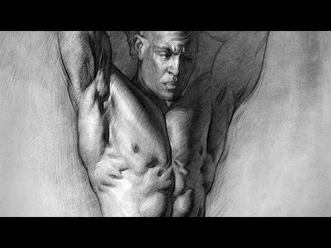
How to Draw and Shade the Human Torso
00
painter_wu posted on 2016/05/06Save
Video vocabulary

start
US /stɑrt/
・
UK /stɑ:t/
- Noun (Countable/Uncountable)
- First time or place that a thing exists; beginning
- Beginning of something in place or time
- Verb (Transitive/Intransitive)
- To do, be or happen for the first time; begin
A1
More draw
US /drɔ/
・
UK /drɔ:/
- Transitive Verb
- To attract attention to someone or something
- To influence a person's involvement in something
- Noun (Countable/Uncountable)
- Something that attracts people to visit a place
- A lottery or prize
A1TOEIC
More chest
US /tʃɛst/
・
UK /tʃest/
- Noun (Countable/Uncountable)
- Strong, lidded container for storing things
- Front of the body between neck and stomach
A2
More edge
US /ɛdʒ/
・
UK /edʒ/
- Noun (Countable/Uncountable)
- An advantage you have over others
- Cutting side of a sharp object
- Transitive Verb
- To cut something to make the blade sharp
- To go around the boundary of something
A2TOEIC
More Use Energy
Unlock Vocabulary
Unlock pronunciation, explanations, and filters

