Subtitles & vocabulary
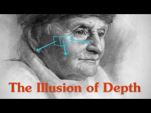
The Illusion of Depth - Contrast, Aerial Perspective and Form
00
vulvul posted on 2015/09/27Save
Video vocabulary

plane
US /plen/
・
UK /pleɪn/
- Countable Noun
- An airplane
- Sharp tool for smoothing or shaving wood
- Noun
- Flat or level surface
A1TOEIC
More smoke
US /smoʊk/
・
UK /sməʊk/
- Intransitive Verb
- To give off a cloud of grey gas from burning
- Uncountable Noun
- Grey gas from fires and cigarettes
- Fog of air coming from e.g. a cigarette, fire
B1
More hat
US /hæt/
・
UK /hæt/
- Noun (Countable/Uncountable)
- Item of clothing worn on your head
- A role or function that someone performs.
- Transitive Verb
- To provide with a hat.
- (slang, computer science) To improve or enhance (code, etc.).
A1
More draw
US /drɔ/
・
UK /drɔ:/
- Transitive Verb
- To attract attention to someone or something
- To influence a person's involvement in something
- Noun (Countable/Uncountable)
- Something that attracts people to visit a place
- A lottery or prize
A1TOEIC
More Use Energy
Unlock Vocabulary
Unlock pronunciation, explanations, and filters

