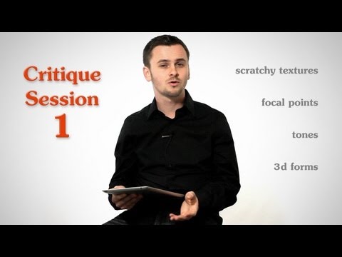
Subtitles section Play video Print subtitles Hey! Happy new year you! Hope you enjoyed your holidays, had a restful break and you're ready to tackle 2013! I know I am! Pow! This episode is dedicated to doing some critiques. Critiques of your artwork you submitted that I promised I would do a few months ago.. In these critiques I’m going toi try to focus on advice that will help you improve your drawings and so most of it will be about things I feel you did wrong. Unless I see someone do something exceptionally well, then I’ll show it as an example of how to successfully do something and as inspiration. But for the most part these will probably be heavier on the negative. So, I apologize in advance, but... I THINK thats what you guys want to hear.. right? I hope so... I’m not here to make fun of you. Well, maybe a little... But my intentions are good. Its meant to be constructive criticism that you can use to grow. And btw, all the artwork I’m critiquing today was submitted by viewers specifically to be critiqued publicly on the show. They knew what they were getting in to. If you’d like to have your artwork critiqued on the show, click this button right here, or the link in the description. This one here. Or the one down there. And then send me your stuff. Ok, here it goes! The first critique goes to Antonio T Pinto For the most part, your proportions, values, and edges are pretty good. Of course theres room for improvement, but, not bad.. In fact I saw some that were really nice. The thing that kinda bothered me throughout most of them was the scratchiness. Sometimes it can be used successfully to add an energy to the draftsmanship, but I think you're taking it a bit too far. It looks messy and distracting. So it's actually taking away from the impact of the drawing rather than adding to it. So I would take it down a notch or two. maybe three... especially in the face, where you're trying to show volume. That much texture flattens the volumes and ages the skin, and can look like scars. It takes away from the realism of the portrait. sometimes making a drawing less realistic can be a good thing, for a specific design purpose, but I just don't see that to be the case here. Except one drawing. Out of the 50 I looked at, this on is the only one that I think actually benefits from the scratchiness because it adds an emotional element that is appropriate here. I saw a few drawings where you're starting to head in the right direction. This one has a little bit of the scratchiness but you're focusing on rendering the volumes in the important areas of the face. so good job here. this part of the hair is good. You're showing some gradations and just the right amount of texture. Down here however you rushed it. You lost the 3d form of the hair and it looks sloppy. Same thing here. This one is close, but needs a little bit of work. Again I think the scratchy background is distracting. I think it's largely because of these white spots in the background surrounding his head. They are fighting for attention and I look there instead of the focal point - his face. So, let's try removing these white spots, and adding some more contrast and light to his face. See, now the background recedes, and the face comes forward! You need to have control of where the viewer looks on your drawing. Decide on focal point and make all your other decisions based on that. Artists are storytellers and we need to be in control. It shouldn't be random. Thank you Antonio, is that your name? Yes, Antonio.. The next critique is for Marcin from Poland. I looked at some of your portraits, and I found them to be too flat. I can see you're starting to add tones, but your still not getting that 3d look. There needs to be more value to show the forms. In this one, you have light on the front plane of the cheek, and then shadow on the side. but then right after that you have light again. and all over the side plane on the neck and head you have lights the same value as the light on the front plane. If this is a directional light, and I think it was, then there needs to be a clearer distinction between the light planes and shadow planes. I can see that you're looking for variations of light and dark, but I'm afraid you're only looking at the variations in small sections. you need to analyze each area as it relates to the rest of the drawing, not just as it relates to the areas immediately next to it. Even though you were correct that this area is darker than this one. You need to make sure that this plane is much darker than this. See how i did not change the relationship between these two areas, this one is still darker than this one, but now we have a clear distinction between light family and shadow family. And I think that's the biggest thing that's hurting these portraits is the tones are really spoty. They're scattered around and they're not coming together to show form. Look at your reference and figure out what direction the light source is coming from. Any plane that faces the light needs to be clearly light. Anything that faces away needs to be clearly shadow. Any reflected light that hits a shadow area, still needs to be a shadow. I recommend you review my video "shading light and form basics" where I go over this in more detail. Also in this drawing, you have what i called 'spaghetti hair'. In my video on drawing hair I talked about defining the volume of the hair first and then adding the texture second. That way you will make the hair mass 3-dimensional, rather than... a bunch of lines. Also a related issue is, because you're drawings are a bit flat, you're relying on outlines to separate the forms. For example with this nostril, you have no tones. It's just an outline of the nostril. This looks cartoony and that's not how we see reality. Same thing here with the jaw, ear, arm fingers.. You're using line to separate the forms. Try to look for the value and the edge. This will give you that 3d look that you're going for. Hope you guys enjoyed these critiques. If you liked this kind of episode, let me know in the comments so that I know this is beneficial for you guys and I will do more episodes like it. And if you liked this episode, I appreciate it when you don't keep it to yourself. Share it with your friends. Don't forget to subscribe to the newsletter on proko.com to get updates on new videos. Thanks for watching!
A2 drawing shadow plane hair antonio focal Critique Session 1 - Scratchy textures, focal points, tones and 3d forms 15 8 vulvul posted on 2015/09/27 More Share Save Report Video vocabulary