
access
US /ˈæksɛs/
UK /'ækses/
- Noun (Countable/Uncountable)
- Way to enter a place, e.g. a station or stadium
- The opportunity or right to use something or to see someone.
- Transitive Verb
- To be able to use or have permission to use
A2TOEICMorebranch out
US /bræntʃ aʊt/
UK /brɑ:ntʃ aut/
- Intransitive Verb
- To expand or diversify one's interests or activities.
- Phrasal Verb
- To expand or extend one's interests, activities, or business.
- To extend or spread out from a central point.
bring to
US /brɪŋ tu/
UK /briŋ tu:/
- Phrasal Verb
- To make someone to wake up from being unconscious
A1Morechallenge
US /ˈtʃæləndʒ/
UK /'tʃælɪndʒ/
- Noun (Countable/Uncountable)
- An activity you wish to try that may be hard to do
- Act of formally inviting someone to compete
- Transitive Verb
- To formally invite someone to compete at something
- To question the correctness of something
A2Morecome together
US /kʌm təˈɡɛðɚ/
UK /kʌm təˈɡeðə/
- Phrasal Verb
- To assemble or unite; to start working together.
- To form a close relationship or bond.
A1Moreconcept
US /ˈkɑnˌsɛpt/
UK /'kɒnsept/
- Noun (Countable/Uncountable)
- Abstract idea of something or how it works
- A plan or intention; a conception.
A2TOEICMoredescription
US /dɪˈskrɪpʃən/
UK /dɪˈskrɪpʃn/
- Noun
- Explanation of what something is like, looks like
- The type or nature of someone or something.
A2TOEICMoreera
US /'ɪrə/
UK /'ɪərə/
- Noun
- Period characterized by particular events, people
- A major division of geological time, usually divided into periods.
B1Morefor example
US
UK
- Phrase
- As an illustration or instance.
go ahead
US /ɡo əˈhɛd/
UK /ɡəu əˈhed/
- Phrasal Verb
- To start an activity; start doing, working etc.
- To give permission to do something
- Intransitive Verb
- To start or proceed with something
- To proceed despite potential obstacles or doubts.
A1Morego back to
US /ɡo bæk tu/
UK /ɡəu bæk tu:/
- Phrasal Verb
- To return to a starting point
A1Morein the first place
US
UK
- Phrase
- To begin with; as the first point or consideration.
- From the beginning; initially.
A1Moreinterest of
US
UK
- Phrase
- For the benefit or advantage of someone or something.
- A feeling of wanting to know or learn about something or someone.
- Noun
- A legal share or right in something.
A1Morelook at
US /lʊk æt/
UK /luk æt/
- Phrasal Verb
- To use your eyes to focus on something
- To focus your eyes on something carefully
A1Moremetaphor
US /ˈmɛtəˌfɔr, -fɚ/
UK /ˈmetəfə(r)/
- Noun
- Imaginative use of words to reveal a similarity
B1Moreobject
US /ˈɑbdʒɪkt/
UK /'ɒbdʒɪkt/
- Noun (Countable/Uncountable)
- Something you can see or touch, but is not alive
- Goal or purpose of a particular plan or activity
- Verb (Transitive/Intransitive)
- To disagree; to protest against an idea or plan
- To state one's reason for disagreement
A2TOEICMoreon a daily basis
US
UK
- Phrase
- Happening every day.
A1Moreremote
US /rɪˈmot/
UK /rɪ'məʊt/
- Adjective
- Being far away from people, towns, etc.
- (Of a possibility) being small or not likely
- Noun
- Radio device designed to operate TV, etc.
A2TOEICMorescript
US /skrɪpt/
UK /skrɪpt/
- Noun (Countable/Uncountable)
- Written text of a book, play, film, or speech
- Set of letters or characters of a written language
- Transitive Verb
- To write a text for a movie, play or speech
B1Morethink of
US /θɪŋk ʌv/
UK /θiŋk ɔv/
- Phrasal Verb
- To look on as (being something specific); consider
- To consider or remember something.
- Verb (Transitive/Intransitive)
- To imagine or call something to mind
A1Morevisual
US /ˈvɪʒuəl/
UK /'vɪʒʊəl/
- Adjective
- Of or relating to vision
- Noun
- Pictures/images used to help audience understand
- A picture, map, piece of film, or other visual representation.
A2More
Vocabulary
- for example: As an illustration or instance.
- think of: To look on as (being something specific); consider
- bring to: To make someone to wake up from being unconscious
- in the first place: To begin with; as the first point or consideration.
- on a daily basis: Happening every day.
- look at: To use your eyes to focus on something
- branch out: To expand or diversify one's interests or activities.
- go back to: To return to a starting point
- come together: To assemble or unite; to start working together.
- interest of: For the benefit or advantage of someone or something.
- go ahead: To start an activity; start doing, working etc.
- access: Way to enter a place, e.g. a station or stadium
- concept: Abstract idea of something or how it works
- description: Explanation of what something is like, looks like
- challenge: An activity you wish to try that may be hard to do
- find: To become aware of something that is happening
- explain: To make clear or easy to understand by describing
- similar: Nearly the same; alike
- object: Something you can see or touch, but is not alive
- script: Written text of a book, play, film, or speech
- metaphor: Imaginative use of words to reveal a similarity
- visual: Of or relating to vision
- remote: Being far away from people, towns, etc.
- era: Period characterized by particular events, people
- spring: Coil of metal that lessens impact, e.g. on cars
- big: Popular
Get the full experience in the app
Learn anywhere with detailed sentence and usage analysis
01:03
She took a brave step forward, leaving behind her comfort zone to chase her dreams.
Vocabulary
- brave
adj. Having courage
- comfort zone
phr. A familiar situation where one feels safe
Explanation
a brave step is a noun phrase, where brave is an adjective modifying the noun step, meaning "a courageous step".
forward is an adverb modifying step, meaning "ahead".
The whole phrase serves as the object, answering the "what" of took (verb) — she took a brave step forward.
Get the full experience in the app
Look up words anytime with pronunciation, part of speech, and usage
brave
US/brev/
UK/breɪv/
adj.Brave
v.t.To bravely face
A2 Elementary
Get the full experience in the app
Practice speaking anytime and get instant pronunciation feedback
Try this speaking exercise.
Try practicing with this sentence.
80
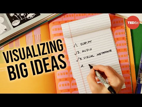
【TED-Ed】Making a TED-Ed Lesson: Visualizing complex ideas
0
稲葉白兎 posted on 2014/12/06Ever wondered how complex ideas like Big Data get turned into awesome animations? This video dives into the creative process behind TED-Ed lessons, showing you how visual metaphors and limited animation bring abstract concepts to life! You'll pick up some fantastic vocabulary related to design and visualization, perfect for understanding how to explain tricky topics.
Learn this video on the APP!
The VoiceTube App has more in-depth practice for videos!