Subtitles & vocabulary
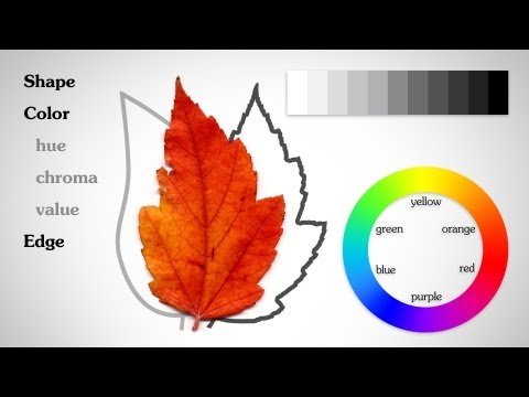
The Basic Elements - Shape Value Color Edge
00
vulvul posted on 2014/09/19Save
Video vocabulary

scale
US /skel/
・
UK /skeɪl/
- Noun (Countable/Uncountable)
- Size, level, or amount when compared
- Small hard plates that cover the body of fish
- Verb (Transitive/Intransitive)
- To change the size of but keep the proportions
- To climb something large (e.g. a mountain)
A2TOEIC
More develop
US /dɪˈvɛləp/
・
UK /dɪ'veləp/
- Verb (Transitive/Intransitive)
- To explain something in steps and in detail
- To create or think of something
A1TOEIC
More important
US /ɪmˈpɔrtnt/
・
UK /ɪmˈpɔ:tnt/
- Adjective
- Having power or authority
- Having a big effect on (person, the future)
- Uncountable Noun
- A matter of great significance.
A1TOEIC
More draw
US /drɔ/
・
UK /drɔ:/
- Transitive Verb
- To attract attention to someone or something
- To influence a person's involvement in something
- Noun (Countable/Uncountable)
- Something that attracts people to visit a place
- A lottery or prize
A1TOEIC
More Use Energy
Unlock Vocabulary
Unlock pronunciation, explanations, and filters

