Placeholder Image

Subtitles section Play video

  • Today on QUICK ESSENTIALS, I want to show you an odd little thing you need to know about color.

  • This kinda blew my mind when I first learned about it.

  • First though, there are 3 different terms we need to be familiar with.

  • This area of the color picker is where you select your hue.

  • Hue is just the color name: red, green, blue, etc.

  • Going horizontally across the color picker is how you select saturation.

  • Saturation is the amount of chroma, or intensity, of a color.

  • And going vertically like this will affect value.

  • Value is how light or dark a color is.

  • Some color pickers look like this, which is largely the same thing,

  • although there are some implications we'll look at later in this video.

  • OK, so a color is always tied to a value.

  • Even though these are two different hues, with two different levels of saturation,

  • I think it's pretty easy to see that the top one is lighter, and the bottom one is darker.

  • And stripping away the saturation, we can easily see where the values of those two colors lie.

  • And because it's value - not color - that makes a picture readable,

  • value is one of the most important fundamentals of painting.

  • No matter what you do with hue and saturation, your decisions there always boil down to value.

  • Now, it's very tempting to think that hue and saturation are independent of value.

  • You know, like, value is determined by this vertical placement ...

  • and then you plug in hue and saturation after.

  • But that is actually quite far from the truth!

  • In fact, every single aspect of your color choices cascades down and affects value.

  • I'll show you an example with saturation first.

  • Here's a color picker and a canvas.

  • I'll use this red hue here.

  • I'll start with a perfectly desaturated version of that, and paint a little swatch.

  • Now, I want to increase the saturation,

  • while staying at the same brightness level on the color picker.

  • So here's another swatch ... change the saturation level ... here's another swatch ...

  • and repeat this process until the end.

  • OK, now check this out: I'm going to convert this to black and white.

  • And the values are different.

  • Adding saturation decreased value!

  • Even though, as I sample these, Photoshop is telling me I'm at the same brightness level!

  • Again, it was a straight line all the way across that color picker.

  • And that's where this triangular pickers are a little bit more visually accurate.

  • This is Corel Painter's color picker, by the way.

  • Its shape implicitly tells us that this value is lighter than this value.

  • And, remember how Photoshop's brightness was not reflecting our value change?

  • On this color picker, as I slide through saturation on the same line,

  • You can see the value slider is now updating.

  • This is a step forward, although it's still not totally accurate.

  • I'll show you why in just a second...

  • but first I want to point out that not all color pickers are made equal!

  • This is Photoshop's "Coolorus" plugin, which is also a triangular picker.

  • (And I like this plugin, by the way!)

  • But here I am doing that same color move...

  • But on this one the value slider stays locked at 100.

  • It's almost like different color pickers are measuring different properties.

  • OK, time to move onto how hue affects value - and THIS is what really blew my mind.

  • So, there's our example with red, at the top.

  • And I'm re-doing the process now with this blue color.

  • And I'm using the same brightness value on this blue as I did on the red.

  • OK so there's our two swatch panels.

  • Watch what happens now as I switch this to grayscale.

  • Your eyes do not deceive you: different colors saturate to different values!

  • This is a crucial piece in the puzzle of understanding color!

  • It's also the source of some digital confusion.

  • Back here in Painter, we've already seen how value does get reduced as I make this move ...

  • However, the reason it's not entirely accurate is that Painter reduces the value of every hue equally.

  • As we've just seen, that's not what actually occurs.

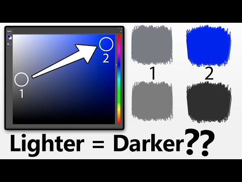
  • In fact, check this out: using this violet color I'll pick a value at 50% on the grayscale.

  • I'll paint a swatch.

  • Now I'll move the color picker up to full brightness, but also full saturation.

  • Paint another swatch, and, are you ready? I'm going to change this to black and white.

  • That is kinda crazy.

  • We traveled halfway lighter on the color picker, and got a darker value!

  • Lighter = darker, dogs 'n cats living together!

  • Now, this is not true for every color, of course.

  • This yellow, for instance, does not get very dark when saturated.

  • I've got my two swatches here, same as with the violet color...

  • We switch to black and white, and this is more intuitive!

  • Yup. That's the stuff that blew my mind.

  • OK, so I've made a chart for you, to act as an overall reference for this.

  • I've got it on two layers here.

  • The first layer is simply a chart with all the hues and various degrees of saturation.

  • And then layer two, of course, is those saturation levels in grayscale.

  • And this is not every granular hue change, but these, to me, are where the significant changes lie.

  • You can find the download link in the description.

  • So, OK, some more digital confusion, I'm afraid...

  • Let's say this represents a painting I want to check in grayscale.

  • The absolute wrong way to do it is to use the Hue/Saturation adjustment.

  • When I strip the saturation here, it just evenly levels everything out,

  • which is completely inaccurate.

  • This is Photoshop, but the same thing happens in Krita ...

  • ... in Painter ...

  • ... and in Clip Studio Paint.

  • So, don't use the Hue/Saturation box to check values.

  • One reliable way to do it is to simply switch the color space to Grayscale.

  • But the drawback is, in Grayscale mode, we can't paint in color anymore...

  • so, I usually don't do it that way.

  • A quick and dirty way to do it is to make a new layer, fill it with white ...

  • And set that layer to 'color' mode.

  • This works across multiple apps, it's pretty reliable,

  • though I do think the contrast is exaggerated slightly.

  • My favorite way to check values - and this is exclusive to Photoshop, unfortuantely...

  • Go up to View -> Proof Setup -> Custom

  • Then click the dropdown here and set it to 'Dot Gain 20%'

  • Now you can press CNTRL + Y to toggle between an accurate grayscale view, and color.

  • And by the way, this stuff happens with real pigments too. It's not just digital!

  • Here are swatches of these very bright and saturated acrylic pigments.

  • When I switch this frame to grayscale, we get the same value behavior.

  • All right, I want to show you how this color theory actually influences my painting.

  • Here's a spooky little sketch I did in October...

  • There's a lot of gray-ish colors in it,

  • So I wanted this area here to have a punch of color.

  • This is the particular blue that I chose for that.

  • And that color choice was directly influenced by the fact that that blue gives some of the darker values when saturated.

  • That way I could have what appears to be a bright, punchy color ...

  • But, when converted to grayscale, it's a sufficiently dark value.

  • Which I'm hoping helps pop the lighter values on the focal point next to it.

  • On the opposite end of the scale...

  • I wanted to have bright colors that would NOT turn into dark values.

  • So my palette choice consisted largely of these colors,

  • which tend to hold onto their light values when saturated.

  • This color theory is always in the back of my mind when I paint.

  • At this point you might ask, "Why does this happen? I mean, scientifically?"

  • Well ... I don't know.

  • But I suspect it might have something to do with the wavelengths of color.

  • You've probably heard this acronym: ROY G BIV

  • These are descending measurements of the wavelength each color occupies.

  • The wavelengths roughly line up with the value chart ... but it's not perfect.

  • For example, red is not the lightest value when saturated.

  • So ... I don't know.

  • Maybe it's a good question for Captain Disillusion.

  • He's got a knack for explaining this stuff!

  • ...if only he knew about this channel...

  • ...I dunno ... is that too far fetched? *crowd gasp*

  • Anyway, I hope this has been an eye opener!

  • Also, I have lots of longer classes where I apply color theory, and show my process from start to finish!

  • Talk about painting fundamentals, and how to apply them to your work ...

  • and lots more.

  • You can find all that at www.marcobucciartstore.com

  • That about wraps it up! I'll see you in the next video!

Today on QUICK ESSENTIALS, I want to show you an odd little thing you need to know about color.

Subtitles and vocabulary

Click the word to look it up Click the word to find further inforamtion about it