Placeholder Image

Subtitles section Play video

  • One is very much revered by English Heritage because they're doing a good job and it's

  • a lovely thing to belong to and I was very pleased to get the commission and it's a very

  • interesting project because it's to do with words and language and colour and everything

  • else and so far touch wood it's going alright. (laughs)

  • I was brought up in the sixties and I think the influences from that time have never left

  • me. And I wanted to be a poster artist when I was, like, seven and I used to make up adverts

  • in my drawing book with lettering on and things like that. And my grandfather was a sign writer

  • for British Rail. In those days it wasn't called British Rail it was called London North

  • Eastern Railway because I come from Darlington County Durham which is on the main line between

  • Edinburgh and London. Big railway town. So there was no real call for people in 1955

  • when I left school at 14 for poster artists because they were all making locomotives and

  • bridges and things like that. But nevertheless I kind of persevered.

  • To start with printing always was black ink, white paper. And if you wanted to use a colour

  • you used red. And I've been trying to kick against that my whole life, you know, get

  • away from this printing background if you like and move into another area and I started

  • to develop the colour thing in about 91/92. I was leaving the black and white behind.

  • So I found these weird colours like awful pinks and browns and funny greens and things

  • but they were kind of interesting when you combined them with other colours. So I used

  • a Pantone book as a reference just to give me an idea of what made that colour, like

  • you mixed it with yellow and with this and with that and you got that. And I never quite

  • got it like that. But I got an interesting colour all the same.

  • And I think it's a kind of backlash against the high end of digital technology and everything

  • is instant and so quick and so fast. The world is speeding up so much. So we are like tortoises

  • plodding along like that, steadily. And you can fly now to Australia in one go and things

  • like that they're talking about.

  • But I don't want to do that, you know. I'd rather take my time.

  • The world is full of visual material constantly.

  • You are blasted by adverts and billboards and TV ads. It's all words words words.

  • The first thing one does at school when you're five years old or whatever it might be, you're

  • taught to read and learn the alphabet. Words and the alphabet become very powerful symbols

  • to recognise and work with.

  • Turps.

  • This type is very, very old. It's like a hundred years old. It's still in good condition because

  • it's made of very hard wood. And most of these letters have been cut by hand and they've

  • been knocking around printers' workshops for generations, and the more they get used the

  • better they are.

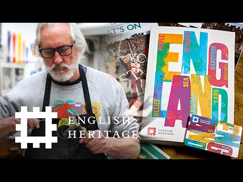
  • 20/21, people, climate, handbook, belief, sea, language, land.

  • The land. You know, this jewel set in the silver sea. I've noticed that if you travel

  • from one county to the next, there's a marked difference. The change. That slight, that

  • subtle change between one county and the next. The fields look different, the field patterns,

  • the colours look different. It's remarkable. You have to be very observant to see it. So

  • that for me is a very English thing, the counties and the county changes. The whole heritage

  • of the thing is fascinating from Dover Castle to Stonehenge, such a vast degree of change

  • in history within quite a short compass. Even though it's a small country in a way, there's

  • a vast change in it from one place to the next. So it's got this rich... tapestry. All

  • these words are linked, aren't they? Land, sea, climate. So land for me is a fragile

  • quality which is delicate and got to be nurtured and looked after.

  • As soon as I get the brief, and these days it comes on the email mainly, used to come

  • on the phone, whatever I'm doing this takes over straight away because I believe in jumping

  • on something immediately while it's fresh and it's there. I do the print-out and I make

  • doodles on the email, my first thoughts. And then those are transferred into my sketchbook.

  • And then, it doesn't stay on the page too long, I then go straight to the material I'm

  • using which is the woodblock type and the inks and then I take it further.

  • Once you've found something that you love, then you must pursue it to the very end and

  • keep at it and work at it. You can't just pick it up one day and leave it the next,

  • you've got to constantly pursue it. I'm very impressed with people like Frank Auerbach

  • for instance, and David Hockney. Big fans of those two. They work every day. Hockney

  • draws every day. Auerbach paints every day. And they're both older than me. (laughs) And

  • I admire that tenacity of intent, forever striving at something and they don't give

  • up, they keep at it. And I think as a designer you should do the same thing.

One is very much revered by English Heritage because they're doing a good job and it's

Subtitles and vocabulary

Click the word to look it up Click the word to find further inforamtion about it