Placeholder Image

Subtitles section Play video

  • Ashley Fortune: Good afternoon from the U.S. Fish and Wildlife Service's National Conservation

  • Training Center in Shephardstown, West Virginia. My name is Ashley Fortune, and I would like

  • to welcome you to our webinar series, held in partnership with the U.S. Geological Survey's

  • National Climate Change and Wildlife Science Center in Reston, Virginia.

  • The NCCWSC Climate Change, Science, and Management webinar series highlights their sponsored

  • science projects related to climate change impacts and adaptation, and aims to increase

  • awareness and inform participants like you, about potential and predicted climate change

  • impacts on fish and wildlife. I'd like to welcome Shawn Carter, senior scientist

  • at the NCCWSC, to introduce our speaker. Shawn? Shawn Carter: Thanks, Ashley. Today, I'm happy

  • to have Dr. Phil Mote present on some of the work that he's been doing with our Northwest

  • Climate Science Center. Phil is a professor in the College of Earth's

  • Ocean and Atmospheric Sciences, at Oregon State University. He's also the director for

  • OCCRI, the Oregon Climate Change Research Institute. He also is director of Oregon Climate

  • Services, which is the state climate office for Oregon.

  • Phil's current research interests include scenario development, regional climate change,

  • regional climate modeling, and adaptation to climate change.

  • Phil is also part of the leadership team at the Northwest Climate Science Center, and

  • has been involved with the IPCC National Climate Assessment, and also the National Research

  • Council. Without further ado, I'd like to turn it over

  • to Phil. Phil Mote: Thank you Shawn, Ashley, and Holly,

  • for setting this up. Thanks to all of you for tuning in. I look forward to your questions

  • at the end. On the first slide here you see the cast of folks involved in this work.

  • My colleague, Dave Rupp, here at Oregon State University, John Abatzoglou and Katherine

  • Hegewisch of University of Idaho. Dennis Lettenmaier, who leads the hydrology

  • group at University of Washington, along with Julie Vano, Homero Flores, and Matt Stumbaugh,

  • Dominique Bachelet and John Kim, who've done the vegetation modeling, I should also add

  • Dave Turner from Oregon State University. This is the culmination of a project funded

  • by the Northwest Climate Science Center, with support also from the NOAA regional entity

  • here, the Climate Impacts Research Consortium. John Abatzoglou and I also had some funding

  • from the USDA funded project, Regional Approaches to Climate Change and Pacific Northwest Agriculture.

  • I particularly want to thank Gus Bisbal, Director of the Northwest Climate Science Center for

  • supporting this vision of providing these scenarios to the Northwest region, which also

  • led to a lot of conversations with CSCs around the country.

  • This project is wrapping up, but we don't have all the results in yet. You'll see our,

  • in some cases, preliminary results. We have a workshop coming up in Portland,

  • Oregon, two weeks from today. We'll spend a whole day on this topic. We'll have our

  • final report due to the Northwest CSC three months after the completion of the project.

  • The motivation for this work was a recognition that natural resource managers were paying

  • attention to climate change science, but at a bit of a loss for how to apply it.

  • If someone told them, "Your habitat conservation plan or this species management plan is no

  • good, because you haven't considered climate change," even if they fully bought the science

  • of climate change, they wouldn't really know where to turn, or how to apply that to such

  • an activity. This is the space that Climate Science Centers

  • intend to occupy, providing such guidance. It was natural that the CSC would play a lead

  • role in this. What we were hearing was a need for a complete

  • and scientific description of what the future would look like in the Northwest Region.

  • Water availability, soil moisture and stream flow, snow cover, flood risk. How will the

  • drivers of climate impact the change in temperature and participation? How will vegetation change?

  • The objectives of this project are to use the best available science to describe the

  • future climate, hydrology, and vegetation. There are fully coupled regional models that

  • have vegetation and hydrology. But, with just a single model as we've learned

  • and as you'll see, a single model is only able to produce a modest spread of results,

  • which may not accurately represent the true range of possibilities, because of how models

  • are constructed and choices that are made. We wanted to be able to characterize the uncertainties

  • of the system. That meant using a different approach than just one single, wonderful model.

  • We want to use a range of climate inputs, and at least two impact models.

  • We have two hydrology models, one of which is nearly done with a set of simulations from

  • 20 climate model scenarios, and a second one that will follow shortly.

  • And then we also have two vegetation models in play. We're fortunate to have a new generation

  • of global climate models that were released in the last few years, and what we've done

  • is coordinate the climate model outputs with the inputs to both the hydrologic and vegetation

  • modeling. And we have a spectrum of audiences ranging from, "I want a simple quality of

  • description, may be a number here and there", to researchers who want the full visible data

  • and the resolution of the model outputs for some additional scientific analysis or modeling.

  • The climate scenarios that we're using as inputs come from the Coupled Model Intercomparison

  • Project stage five, CMIP5. This is a coordinated global modeling effort that uses 41 models

  • that have been contributed to date for the 20th century.

  • About 25 or 30 that have done simulations for the 21st century. These started to be

  • available in the year 2011 and they're still being uploaded to various archives.

  • We wanted to evaluate these models on the regional scale, and we've done this now both

  • for the Northwest and to a lesser extent the Southwest, but also for the Southeast, and

  • then recommend some models that are top tier. There are enough models that we can get a

  • pretty good spread of results using the ones that performed well in the 20th century.

  • Now I would note that there is a supposition here that the performance of a model in the

  • 20th century is an indication of how well it will do in the 21st century. We don't know

  • whether that's true, but it seems reasonable and we use model performance to shape our

  • choices for models in the future. Then, John Abatzoglou at the University of

  • Idaho who had developed this MACA, Multivariant Adaptive Constructed Analogue approach to

  • downscaling, has downscaled 20 GCMs for the whole continental U.S.

  • We were initially intending to just do the Northwest, but it turned out not to be that

  • much work to do the whole continental U.S. Then we also have a comparison, which I won't

  • talk much about. A comparison with the previous generation of models, CMIP3, which was released

  • around the year 2005. The drivers for these global models are what

  • are called Representative Concentration Pathways, or RCPs. You'll see this in a number of slides,

  • it's worth taking a few minutes to explain. Socioeconomic modeling has postulated a wide

  • variety of futures for the world depending on both market and non market forces, on policy

  • choices, on availability of fossil fuels and a wide range of other considerations, and

  • also global population. I draw your attention to the orange curve,

  • the RCP8.5. This is a world in which development is fairly unfettered and in which coal is

  • widely available and remains cheap, and the developing countries are able to rapidly follow

  • the developed world into a much more prosperous and consumptive future.

  • RCP6 is a more modest version of that, in which the carbon dioxide amounts by the end

  • of the century don't quite reach 700, versus over 900 for RCP8.5. RCP4.5 is more of a gentle,

  • sustainable future where carbon dioxide amounts level off by around 2070 at 540 parts per

  • million. Climate continues to change a little bit after

  • that, but it's a rather different future. And then finally RCP3PD, which is also known

  • as RCP2.6, is intended to reflect the postulated success of policies which would reduce greenhouse

  • gas emissions so substantially as to limit the global temperature change to two degrees

  • Celsius, which is a stated goal of many governments. It's all a very totally Pollyanna view of

  • the world, dialing back emissions so dramatically would be politically and economically a very

  • heavy load. For this work we're going to focus on the

  • gentle, sustainable, RCP4.5, the green curve and RCP8.5. Those are shown here in comparison

  • with the earlier generation, the CMIP3 model input and that's the dashed curve.

  • The RCPs also extend beyond the year 2100, that's an important distinction. You see there

  • the RCP2.6, which initially is fairly similar to the others, to about 2025, and then departs

  • rather dramatically. The Y-axis here is Radiative Forcing.

  • This is essentially how much extra energy is added in watts to each square meter over

  • the earth. The amounts are initially a little over one watt per square meter, and they rise

  • from anywhere from 2.6 by the year 2100, all the way up to 8.5, and that's what the numbers

  • for the RCP correspond to. These are the 20 models that we're using in

  • this study, listed in alphabetical order by country. And you can see there a number of

  • entries from several different countries. This is, again, a subset of the total ones

  • available, and the next several slides will show that the climate variables for the northwest,

  • including a spread across the models to show the uncertainty.

  • They're smoothed for easier reading. Later you'll see some un smoothed curves that indicate

  • why we want to smooth them. This is a result of a model ranking approach that David Rupp

  • came up with and was published last year. Which he's also now applied a dimension to

  • the southeastern U.S. for the Southeast CSC. It's a fairly complicated approach, as explained

  • in the paper. It includes a variety of metrics of spatiotemporal variability, of temperature

  • and precipitation. We use this to guide our selection of models,

  • tending to recommend we use the ones on the left hand of this figure.

  • We'll start on the climate model results with the slightly complicated figure. The only

  • one of these I'm going to show, but I have a reason for showing it. What this figure

  • shows is the change in temperature and precipitation, the Y and X axes respectively, for this set

  • of models currently available. The number is the model rank, one is the best

  • and 30 something is the lowest. Not all models are included because as I noted before, some

  • models that had 20th century runs which led to the ranking did not have 21st century runs,

  • and those are gradually being filled in. But generally the numbers in the 20's and

  • 30's models works on the 20th century. The plus symbol is the mean of all of the model

  • simulations for that RCP. The dark numbers have MACA data available and the light are

  • not available. The gray shading around both the X and Y axes

  • are the percentiles of inter annual variability during the 20th century.

  • It helps us see, for instance, looking at just the X axis variability, that most of

  • the models say that the future, late 21st century precipitation, annual mean precipitation

  • will be within the range of variability experienced in the past.

  • If you look at those plus symbols, they're shifting by only five percent or eight percent.

  • Some of the models, in the upper right hand corner, you see 11's and 29's, indicate large

  • increases in precipitation. No models indicate large decreases in precipitation.

  • I circled the number 15 because for some of the results you'll see we're going to focus

  • on that model, the MIROC5 model, because it's in the middle of the pack and it's a reasonably

  • good performer. This is the first of several slides like this

  • that I will show, where the 20th century simulations are shown in gray, with the all model average

  • shown as the heavy black line. And then going into the future where RCP4.5

  • is shown in yellow with one heavy curve ending at about six degrees Fahrenheit warming, and

  • the other heavy curve for RCP8.5. You notice the RCP4.5 and 8.5 worlds start to diverge

  • somewhere around 2030 or 2040. And by the end of the century not only are

  • they five degrees Fahrenheit difference in the multi model average, but notice the slope

  • as well. The RCP4.5 world has climate starting to stabilize, and the RCP8.5 world is continuing

  • to change at a pretty rapid clip. There's an overlap between the two that's

  • indicated in orange, and you can see the range of variability is a couple of degrees Celsius,

  • or several degrees Fahrenheit. The coolest model down at the very bottom

  • of the yellow area would give a warming of only a couple degrees Fahrenheit by the end

  • of the century in the RCP4.5 scenario, whereas the hottest model in the RCP8.5 would have

  • us warming by about 15 degrees Fahrenheit. Many of the results that I'll show later are

  • either from my level five, or from the all model average.

  • This is the same kind of plot for precipitation, and you'll notice that there was very little

  • change during the 20th century. Even during the 21st century only a few percent

  • change for the all model average. Now you remember from the complicated scatter diagram

  • there were a few models that indicated large increases in precipitation.

  • But the robust message is that there doesn't appear to be a solid indication that precipitation

  • would change dramatically in the annual mean. We'll come to the seasonal differences shortly.

  • The MACA data, which are summarized here for the Pacific northwest region, includes other

  • variables like wind speed. This is the plot of change in the average wind speed over the

  • northwest. A decrease of roughly five percent for the

  • all model average for the RCP4.5, but slightly more for RCP8.5. This appears to be because

  • several models tend to have the Pacific storm track shifting farther north we get fewer

  • windy winter storms. The diurnal temperature range is important

  • for many ecological applications, and here we start to see some interesting seasonal

  • variations. Winter diurnal temperature range decreases, and the summer diurnal temperature

  • range increases. Notice the Y axes are somewhat different here, the decreases and increases

  • are fairly comparable in magnitude, roughly one degree Celsius. And this is mostly having

  • to do with changes in cloudiness, as indicated by this figure.

  • Now, we don't yet have full results for RCP4.5, so all that's shown here is RCP8.5. But the

  • winter, shortwave radiation goes down indicating an increase in cloudiness, which is also connected

  • with the decrease in diurnal temperature range. Then in summer, the reverse is true and a

  • decrease in cloudiness leads to an increase in incoming shortwave radiation and an increase

  • in diurnal temperature range. The maximum temperature in June, July, August

  • is shown here, along with the MIROC5 results. And again, all results have been smoothed

  • so that you're not seeing thousands of individual symbols indicating each model's annual output.

  • But the results here broadly align with what's been observed, an increase in the summer daily

  • maximum temperature of a couple of degrees. And then going out into the future, pretty

  • substantial increases in summer temperature, especially in the RCP8.5 scenario.

  • Much more modest in the RCP4.5. Seasonal precipitation in general, the seasons include models that

  • say it will get wetter and models that say it will get drier.

  • So these broad shaded areas you see for winter, almost all of them go up, but some of them

  • don't go up much, and in the individual models, there are some that go down for winter.

  • Likewise for summer, the average precipitation averaging across all the models goes down

  • somewhat. For some, it goes down dramatically, and for some it goes up. A lot more ambiguity

  • about changes in precipitation, even on the seasonal time scale, than about changes in

  • temperature. All of these data are available from the MACA

  • website, and I'll repeat this URL on the last slide so you don't need to scramble to write

  • it down. This is a screen shot of the MACA website,

  • and if you do intend to use this, I strongly suggest that under analysis tools, you read

  • the FAQ and guidelines on applying scenarios so that you can avoid common pitfalls.

  • On the right you see the variables, many of which I just showed you. You can do time slices,

  • 2040 to 2069 or 2070 to 2099. You can also do some time series on other things. I selected

  • the maps option here to give you a sense of exploring some of the possibilities.

  • The reason that we do the MACA downscaling is that the raw model output looks something

  • like this. This is the change in temperature at roughly the spatial resolution of a typical

  • global climate model. And you can see that the pixels are roughly one to two degrees

  • longitude by latitude. This figure shows the same map, but from the

  • MACA downscaling. And you see much finer features. The way MACA works is essentially to use large

  • scale global model outputs in connection with fine scale observations to do a statistical

  • connection between the two. It still can't see mountains, so as I'll show

  • shortly, we're also using regional modeling. But this gives you a sense of what MACA is

  • about. This is the same kind of map, but for winter diurnal temperature range.

  • And you can see those reductions we were seeing earlier are not ubiquitous in the Northwest

  • region, but they're really concentrated over the Rocky Mountains.

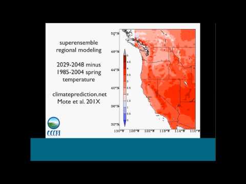
  • This is a sample of the results from some regional models. This is what we call a super

  • ensemble where we use volunteer's personal computers to complete tens of thousands of

  • one year simulations. We've got 1960 to 2009, we have 130,000 simulations over that period,

  • and then 2029 to 2049. And this shows the difference in temperature

  • in the spring from these modeling results, and if you know anything about the geography

  • of the Western U.S., you'll recognize that the mountain ranges tend to warm more than

  • the lower elevation areas around them. You see the Cascades in Washington and Oregon

  • warming more than the areas to the east and west of them. And then down into California,

  • the Sierras and Trinity Mountains warming more than their surrounding areas.

  • And then the same thing over in Utah with the Wasatch Mountains, and then to some extent

  • the Rockies in Idaho. We've done a little bit of analysis, and this seems to be linked

  • both to changes in solar radiation, (i.e. cloudiness), and also snow pack.

  • These are interesting and important results, but we have not fed them into the vegetation

  • and hydrologic modeling, the results I'm about to show are from the MACA data.

  • A summary for the climate, all of the scenarios show warming in every season. However, there's

  • a very wide range, we can't say with confidence what the amount of warming will be, only that

  • it will warm. And our forthcoming publications include tables

  • with estimates of the 25th and 75th percentiles and a lot of other statistics. The omissions

  • scenario starts to matter a lot after about 2030 in the total amount of warming that you

  • get in any given period. The models with the least warming in the 21st

  • century, I forgot to point this out on the scatter diagram.

  • Down in the bottom of the scatter diagram, the models with the least amount of warming

  • tended to have numbers in the upper 20's and 30's.

  • Meaning that they didn't do very well with 20th century climate. This suggests that a

  • quality weighting on the models leads to a slight increase in the estimate of the lower

  • bound of warming. Seasonal differences: summer appears to be

  • somewhat warmer and drier and sunnier than other seasons. It trends in that direction,

  • not just the baseline. And winter is somewhat wetter and cloudier.

  • In other words, an accentuation of the existing seasonal cycle with enhanced warming in summer,

  • less precipitation in summer, more in winter. And then the regional modeling strongly suggests

  • the mountains, especially in spring, will warm more.

  • And for the hydrology modeling, we used a couple of different approaches. We started

  • with a sensitivity approach, which is to compute the response in flow at 200 plus points in

  • the Northwest. The small changes in temperature and precipitation, using one of these hyrdologic

  • models. This is all based on some work that Julie

  • Bano did, which was the cover article in the most recent issue of the Bulletin in the American

  • Meteorological Society. She initially did this work, and that's what

  • was just published in the Colorado River basin, and now she's done it for the Northwest. This

  • is a useful way to explore uncertainty, and I'll show an example of it next.

  • The second approach we use is to do full, distributed hydrologic modeling using the

  • Variable Infiltration Capacity, VIC model developed at the University of Washington

  • over 20 years ago and continuously updated since then.

  • It's really the workhorse for climate impact studies in the U.S. and around the world.

  • Dennis Lettenmaier, the head of the hydrology group at UW has recently developed a Unified

  • Land Model which is a merger of two other models. Those simulations have not yet been

  • completed, but they're on the way. And again, the objective is to use available

  • tools to characterize and quantify the range of possibilities, or the uncertainty. This

  • is a brief additional detail. The Unified Land Model is the merger of the Noah and Sacramento

  • hydrologic models. On the right are the equations that describe

  • the sensitivity approach. The elasticity of precipitation is a flow response where Q stands

  • for flow to a one percent increase in precipitation and the temperature sensitivity is the flow

  • response to a tenth degree increase in temperature. And we've done that on a monthly time scale,

  • seasonal and annual time scale to fully understand what's going on. This is an example of the

  • sensitivity approach applied to the Willamette River basin.

  • The VIC model was run with the baseline historical climate, and then increasing the temperature

  • and separately increasing the precipitation. We've done this for temperature increases

  • one, two, three and four degrees Celsius, which is why the curves here are nonlinear.

  • I'll explain the curves in a minute. This is the same kind of scatter plot that

  • you saw earlier, with the listed models indicated as numbers, and the precipitation change on

  • the X axis and the temperature change on the Y axis.

  • We're now taking the precipitation season of January through June that makes the most

  • difference for June, July, August stream flow. And likewise, the temperature change October

  • through June which makes the most difference. The curving lines are the outputs of the sensitivity

  • approach and they indicate a constant, or the same amount of change, in the summer flow.

  • If you start down at the bottom at 0, 0, there is a zero percent curve which tracks up into

  • the right. You'll see that a one degree Celsius increase in temperature can be offset roughly

  • by a ten percent increase in precipitation in that season.

  • As the warming gets more and more, it takes less and less precipitation increase to offset

  • the temperature increase. The curves end up at the top of the diagram going almost vertical.

  • Now you can see there's only two models that suggest an increase in summer flow, model

  • number 15 and model number 21. The big plus symbols indicating the averages

  • for RCP4.5 and 8.5 are in the 20 to 25 percent decrease range, if you see the contoured labels

  • down at the lower left part of the diagram. And the most extreme scenarios are those from

  • model number seven, the HodGEM2 model, which has been a solid performer in the Northwest.

  • That leads to decreases of, according to our linear estimates here, over 50 percent in

  • the summer as well. This is the quick way to get a sense of what

  • the probability distribution is of changes in flow, given in this case over 100 scenarios

  • from different climate models. Now for some early results from the VIC modeling,

  • again from MIROC5. This is for the Columbia basin at Dalles, the cold part of the Northwest.

  • 1950 to 2005 shown as solid curves, and 2006 to 2100 shown as dashed curves.

  • Even with some increases in precipitation in this MIROC simulation the shift in the

  • flow is quite pronounced starting in March future flows are quite a bit more than past

  • flows, and starting in June the future flows are quite a bit lower than past flows.

  • Which as we've seen in earlier studies is indicative of a reduced role of snow melt,

  • and we'll show the snow melt shortly. August soil moisture, this is what is called an exceedance

  • probability curve. If you haven't seen these before it may be

  • a little bit confusing, but at the left edge are the largest amounts, that is the amounts

  • that are never exceeded, they have an exceedance probability of zero. On the right are the

  • lowest amounts, they have an exceedance probability of 100 percent.

  • The future distribution across the board shifts by about 10 or 15 percent: so the lowest soil

  • moistures in the future drop from 255 millimeters soil depth to 230.

  • Now I'm going to step quickly through the MIROC results for snow. So this is an historical

  • simulation. So notice the very bright white amounts, very high amounts on the east slopes

  • of the Cascade Mountains on the left edge of the map, and also in the Rocky Mountains

  • on the right edge of the colored part of the diagram.

  • This is the same thing now on the left but for 2021 to 2040, and the right panel shows

  • the percentage change. So at lower elevations the percent change is quite dramatic, 60 to

  • 100 percent. You can even see that happening in the river valleys as well up in British

  • Columbia, for example. Notice there are some places, the higher elevations,

  • that see increases in April snow water equivalent. I'm now going to step forward to 2040, and

  • you'll see more blue, less white on the left diagram and more red on the right diagram

  • 2060 to 2080, and then 2081 to 2100. To summarize the hydrology, note these are

  • preliminary results. The sensitivity approach is a promising way to get a large number of

  • simulations and estimate what the effects would be of a wide range of climates.

  • What we find is for the current generation of models the Willamette flow would decrease

  • by about 25 percent with a range from 0 to a little over 50 percent.

  • Snow greatly decreases over the 21st century as we saw in the MIROC5 maps, and late summer

  • soil moisture also decreases and lots more simulations to follow. These are preliminary

  • results. Now for vegetation, a quick word about the

  • two vegetation models we're using. These are constructed differently. They have different

  • approaches entirely. Whereas our two hydrologic models are both disturbed models that use

  • water and energy balance, these use quite different approaches.

  • The MC2 is a dynamic general vegetation model. The intent is to simulate the bio geography,

  • that is essentially what grows where, keying into key seasons for climate variables. It

  • also simulates bio geochemistry and wildfire interactions.

  • Plant types in the model are distinguished by whether they're evergreen or deciduous

  • and by leaf shape. The main climate drivers are the temperature in the coldest months

  • and the precipitation during the growing season. Those determine the dominance of the life

  • forms: grass, shrubs and trees. The simulation domain that we're using here is Western US.

  • The 3PG model is the forest physiology model. It has a light-use-efficiency based photosynthesis

  • algorithm. It simulates net primary production, which MC2 does as well, but with a somewhat

  • different approach. It also simulates wood production and forest succession.

  • Model outputs like the soil water and the vapor pressure deficit predicts species presence

  • and absence. Nicholas Coops who is the primary author on the 3PG model, published this study

  • in 2011 showing that this species presence/absence accuracy was 82 percent for 20th century climate

  • and the domain here is Western US as well. For some purposes the results will be aggregated

  • by ecoregions as shown here. For these purposes for simplicity I'm going to show Northwest

  • average results and also Willamette Valley, which is ecoregion number three over near

  • the left edge of the diagram. This is for the northwestern part of the domain,

  • north of 42 degrees and west of 111 degrees longitude. This is curious.

  • You can see at the bottom the model simulations that went into the MC2 model shown here. The

  • RCP8.5 scenario has the vegetation carbon initially decreasing to about mid century

  • and then starting to increase again. Essentially what happens is the wildfires

  • over the first half of the century, which are indicated here, gradually increase, and

  • there's a reduction in certain types of trees and then a transformation to other types of

  • trees. And as the wildfires decrease towards the

  • end of the century, the vegetation carbon increases again.

  • This is more dramatic if we look just at the Willamette Valley. This is now ecosystem carbon,

  • which is a little different from vegetation carbon, and the initial carbon storage drops

  • by about 20 percent from the beginning of the runs to about 2070, and then it starts

  • to increase again. Again, this has a lot to do with wildfire.

  • It's more dramatic here. The spikes are unfiltered time series for individual models, and you

  • can see each of the models at some point has a big fire in the first half of the century

  • and then things quiet down. What can burn has burned, and we're left with

  • a new configuration of vegetation. This is a fairly dramatic example of this transformation.

  • These results are available from a website. The URL will follow shortly, but, again, there's

  • some mapping tools where you can select an ecoregion, select some variables.

  • You can output both the climate data, which are the inputs, and then also these diagrams

  • on the lower right, which indicate the fraction of domain that's in forest, shrub, grass,

  • or desert. These in some cases show pretty interesting

  • and dramatic transformations from one type of vegetation to another. This is an example.

  • This is for...this is not for the Northwest, but it shows the kinds of plots that we'll

  • be making available shortly. For a particular model, the CanESM2, over

  • this domain the forest increases at the expense of grassland and especially desert.

  • This is one preliminary slide results from the 3PG model. The upper left is, again, our

  • favorite MIROC model, the net primary productivity in the 1990's on the right, the same thing

  • for the 2090's. At first glance they look quite similar, but

  • if you look, for example, in the Willamette Valley or the northern Sacramento Valley of

  • California you'll see some pretty big reductions, and the bottom left panel shows the reduction

  • amounts. You see that for the inland west the brown

  • color, which indicates small reductions between 0 and negative 3 of these units which I've

  • forgotten what MGDM stands for that color is pretty prevalent in the western U.S.

  • The lighter brown color is prevalent in the coastal parts of Washington, Oregon, and California,

  • larger decreases in NPP, and, again, this model also indicates changes in NPP possibly

  • related to fire and other things. Again, some preliminary results, the summary

  • for the vegetation. West wide increases in stored carbon and net primary productivity

  • for RCP8.5. The burned area increases initially and then

  • decreases, especially in the Willamette Valley, fairly large transition in vegetation, which

  • we're still working on for the Willamette Valley, and some shift in vegetation to shrub

  • and forest across the West. The MC2 results are at this website, which,

  • again, I'll repeat this URL at the very end of the talk.

  • A summary of the whole talk, climate models indicate robustly that the region will warm

  • in the 21st century as it has in the 20th century, but more dramatically.

  • We're still catching up to the carbon levels emitted over the last few decades so there's

  • a time lag between emissions of carbon and warming. So we're locked into some additional

  • warming, but also the emissions are increasing rapidly.

  • Precipitation changes are uncertain. There's a general tendency for winters to be wetter

  • and summers to be drier. There are profound shifts in some basins in snowmelt driven hydrology

  • with summer flows decreasing even in fairly rain dominant basins like the Willamette.

  • In some places there will be wholesale changes in vegetation types and in fire risks. That

  • seems to be more of an issue west of the Cascade and Sierra Nevada Mountains than east.

  • That is the extent of my talk. For more information as I mentioned there is a full day version

  • of this in two weeks. It will also be webcast. You can sign up for the web cast or for the

  • workshop at our website occri.net. You can get the climate data from this URL or vegetation

  • data from that URL. Now I'd be happy to open it up to questions.

  • Hi, David. Thanks for tuning in. Always enjoy interacting with you. That's a very good question.

  • The question is why would anyone choose MACA over the BCSD monthly ARRM or other products?

  • Have you done an inner comparison that shows the advantages and disadvantages or a comparison

  • to regional climate modeling outputs? Yea, so there are, as you note, a wide range

  • of downscaling products available. Previously BCSD, which was sort of the workhorse was

  • primarily monthly, and the reason for that is that it relied on the outputs of the climate

  • models. The CMIP3 models only made available monthly outputs with a few exceptions.

  • This time around at CMIP5 we do have daily outputs and BCSD has been repeated with all

  • the CMIP5, or a great many of the CMIP5 model simulations, and that's available as well.

  • Part of the reason that we were interested in using MACA was that it has a lot more variables

  • available as I noted, not just max and min temperature and precipitation, which are available

  • through BCSD, but also wind speed, solar radiation, relative humidity, which as it turns out are

  • the variables that a large number of impact models want to use.

  • John initially developed MACA for input to fire modeling, but it's also useful for the

  • MC2 vegetation modeling and for the hydrologic modeling.

  • In fact, we had a separate project to see how including the full suite of MACA inputs

  • changed the simulation of stream flow with VIC, and we do see some improvements, particularly

  • in drier climates with the treatment of solar radiation.

  • It's not a panacea. There may be a better approach that comes down the road, and we

  • would love to use regional modeling outputs. The problem is that aside from the NARCCAP

  • there are not - which is a whole separate conversation that I don't want to get into

  • here it's difficult to find a good range of regional models except with our super ensemble,

  • and we're pretty excited about that. We're going to do some new runs that include

  • full daily outputs so that we can start using those for inputs, and we can play around with

  • model parameters to get a bigger spread in temperature and precipitation projections.

  • You asked if we compared MACA with regional modeling outputs. If you think back to the

  • slide I showed of the temperature change from the regional model, no statistical downscaling

  • approach is going to be able to mimic that terrain induced change in climate where there's

  • something going on in the regional model. It's an interplay between clouds and snow

  • in the mountains that leads to more warming. Statistical approaches can only key off what

  • the global model does, and if the global model doesn't know there's a mountain range there

  • it's not going to be able to have that cloud and snow interaction.

  • Ashley: Thank you. We have another question from Laura. It says, "How reliable are the

  • fire predictions from the vegetation models?" Phil: We won't know until we get there, right?

  • Yes, that's a good question. The fire modules in MC2 have been tested to some extent against

  • observations. The problem is you never know when a fire would occur or how big it will

  • be given fire conditions. In some ways it's pretty difficult to compare

  • a past simulation of fire with observations. That said, we know that warmer, drier summers,

  • especially in the Northwest, lead to greatly increased average area burn, and mechanisms

  • like that are in the fire module. But, yes, we won't know how well those perform

  • with future climates, because we're going to...until we get there, because the hot,

  • dry...the heat and dryness of future summers will very likely exceed anything we've experienced,

  • and we won't know exactly how these systems will react.

  • Another thing to note about these vegetation modeling efforts. The system as simulated

  • is a bit more responsive to climate changes than the actual system. What I mean by that

  • is, although there's a bit of history built in, part of what's being simulated is the

  • potential vegetation. Particularly when we talk about vegetation

  • distribution, which I left those results out, but they influence the net primary productivity

  • and the fire, when the vegetation changes in the model it changes more rapidly than

  • in the observations. Unless there's just been a fire then something

  • new can grow in. Ashley: Thank you. We have a question from

  • James Rourke. "This is outside the scope for the current talk, but is there any plans to

  • address climate change effects on coastal ecosystems?"

  • Phil: True, that's outside the scope of this talk. We're really trying to describe the

  • broad scale changes. There are coastal ecoregions in the vegetation

  • models, and they unsurprisingly change less, because the ocean moderates the climate change

  • somewhat less than the Willamette Valley and other inland locations.

  • But as for more broad scale types of impacts that's...we leave that to others to work out.

  • Ashley: Amy Daniels asks that you go back to the model ranking graph, and if you could

  • explain that in a little bit more detail. She wants to confirm that it was for native

  • resolution of GCM simulations. Phil: OK. I should be able to see the figure

  • now. These were...I believe David first interpolated these to a common grid for comparing with

  • observations, and the observations were coarsened in a similar way so that we could have a fair

  • comparison. I don't remember the second part of Amy's

  • question. Ashley: The second part is...sorry, pulling

  • it right back up. It says, "Was that for native resolution GCM simulations?"

  • Phil: Yes. OK, so just one question. Ashley: Yes.

  • Phil: OK. Ashley: Amy, does that answer your question?

  • Was that enough detail for you? While she's getting back to it we'll take another question.

  • It's from Kavita. It says, "The two vegetation models are still at relatively coarse ecoregional

  • scale. To be a great use to natural resource managers

  • at small scales, are there any efforts to develop finer vegetative models for the Northwest?"

  • Phil: Yes, thank you, Kavita. I was not clear in describing the details of these models.

  • The MACA outputs are at quite fine scale, and both the hydrology and the vegetation

  • models were also run at quite fine scales. I believe four to six kilometers in both cases.

  • That level of detail is available. I didn't highlight the fineness of the resolution in

  • the results that I presented. I'm going to steal back the camera here and

  • put the hydrologic model up. This is roughly the same spatial resolution in the hydrologic

  • model that's also used in the vegetation model. You can see some pretty fine details there.

  • For instance in the Washington Cascades you can see the low snow area in the Yakima Valley,

  • which slices east to west, roughly at the latitude of Puget Sound.

  • And up in the Canadian part of the basin you can see, the Colombia River Valley roughly

  • paralleling the Continental Divide as a very low snow area

  • Then, up towards the north end of it, you can see it's one pixel wide and the mountains

  • around it are quite a bit higher and snowier. It's the same kind of thing for the vegetation.

  • Here's the native resolution of the vegetation model, the 3PG model. Again, you can see the

  • actual details are at a few kilometers resolution. Phil: We had another question that came in

  • by text, too. Ashley: Yes, Amy asked "What went into the

  • principal component analysis, if she's understanding that correctly?"

  • Phil: Yeah, fair question. The point of principal components analysis was basically to cluster

  • types of metrics that were similar. For instance, if you think about various temperature

  • metrics, the area average temperature, if a model is too warm in the annual mean, is

  • it also too warm in the winter and the summer? Those might be related. Is the summer minus

  • winter difference, say, in temperature or precipitation related?

  • There were about 20 different metrics that went into this. The point of the principal

  • components analysis was to reduce them to meaningfully different ones that ended up,

  • some covering spatial values and others temporal variability.

  • For details, see the paper. It would take a while to explain the next level of complexity,

  • but that's the upshot. Ashley: We have one from Robert. It says,

  • "Can you explain further the projected wintertime trends of the modest precipitation increase?

  • More cloudiness and less wind speed. Less wind speed because the storm track is farther

  • north, and then more precipitation because warmer air can hold more moisture. What about

  • the cloudiness?" Phil: Yeah, that's a good question. We haven't

  • dug into those results in that level of detail. The shifts in the storm track are probably

  • modest. The average across all models... This isn't our work, but it was in the report

  • of the Intergovernmental Panel on Climate Change. It's only a couple of degrees latitude

  • shift by the end of the century. The storms do carry more moisture. You're

  • quite right about that. We may get fewer of them. As to why we get fewer storms but more

  • clouds, again, that's something that we haven't looked into.

  • Ashley: Thank you. Phil: Good question, though.

  • Ashley: Then we'll have to bring up the link again for the integrated scenarios calculator.

  • People would like to write those down. Phil: OK.

  • Ashley: A question from Paul. It says, "How detailed is the vegetation information. For

  • example, does it define tree species that are changing?"

  • Phil: No, not quite. There are vegetation classes. MC2 and 3PG handle them differently.

  • There are a variety of tree species collected into one type.

  • I showed the example of the wholesale shift from one type of vegetation to another. Those

  • are large vegetation classes. There are also much smaller groupings that

  • are the native outputs of the models. You can learn more on the website here, "Conservation

  • Biology." Ashley: Then, again from Paul, it says, "When

  • you say that there is uncertainly in the precipitation trend what level is the uncertainty, especially

  • in regards to the winter precipitation?" Phil: Yeah, great question. Here is that same

  • kind of scatter diagram that I showed before. This is the diagram for winter. On the right

  • you can see the tables that summarize range and the twenty fifth and seventy fifth percentile.

  • The table there in the middle that says, "Change in precipitation." For the RCP8.5, there's

  • one model that has a 29 percent increase. I would note that if you look on the diagram

  • and you look closely, you would say, "Wait a minute, I see an 11. That's not that 35

  • percent." The reason the 35 percent isn't shown is that

  • there are number of 11's. Those are all different stimulation's from the same model, and those

  • have been averaged together before inclusion in the table on the right.

  • All of model number 11 averaged together gives about a 29 percent increase in winter precipitation.

  • The 75th percentile is 11.5. We're going to have to get to the bottom of

  • this. I'm not understanding why the mean of the twenty fifth percentile go up. The minimum

  • is 7.5 percent decrease. Ashley: We have a couple more questions as

  • we're running out of time. Steve Klein, you can ask your question now. Please remember

  • to press *6. Steve Klein: Phil, my question is in regard

  • to the vegetation models and whether in fact it's possible to leverage this modeling work

  • and use the drivers of moisture and temperature to look at the effect of plant associations.

  • In other words, is there a level of refinement that can build upon what's been done in these

  • two models? Phil: Yeah, I'll have to talk to the vegetation

  • modeling folks and get back to you on that, Steve. It's a good question.

  • Steve: One comment, if the host could send those links out to the data sources and where

  • the webinar would be posted, that would be helpful to the participants.

  • Ashley: Yes, Holly will be sending the information out. It takes about one to two weeks to edit

  • the recorded version of the webinar and get it closed captioned. She will send that all

  • out. Currently the link is there in the chat box,

  • when we go back to that screen. That's going to be where this webinar, as well as all the

  • previous webinars, are held. Steve: Thank you.

  • Ashley: All right, a question from Nancy Green. She says, "Excellent webinar. You mentioned

  • some applications are available for the Southwest and Southeast. How can we get that information?"

  • Phil: The MACA data are available for the whole continental U.S. That's from the website

  • shown here. The hydrology and vegetation modeling is available

  • west of, I think, 105 degrees longitude. I need to check. Those have not been done for

  • the Southeastern US. What I specifically mentioned had been done

  • for the Southeast is the same model evaluation approach that we published in JGR last fall.

  • Those were done for the Southeast CSC in a project that's taking place this spring. We

  • haven't yet handed off the results. We're still in process with that. But you

  • can check back with us or with the Southeast CSC in a month or two. That's, again, only

  • the model evaluation part for the climate models.

  • Ashley: Thank you. And our last question will be from Paul, which says "The trend from the

  • desert to the forest is surprising. A trend from Douglas fir to the pine, or the pine

  • to the scrub would be more expected. What is driving those predictions?"

  • Phil: I'm not even sure the domain that that covered, that was for a different project.

  • The graphics for the Northwest are still being developed, and we're not prepared to show

  • this yet. And without knowing what domain that covered,

  • I can't comment intelligently. I included that as an example of what's about to be available.

  • But presumably, increases in precipitation, which show up in some areas to drive that

  • kind of change. Ashley: Excellent, thank you. And I do not

  • see any more questions. Holly or Shawn, did you have any closing remarks?

  • Shawn: No closing remarks, I guess, other than we will be, in addition to posting the

  • material on the web, people would like some additional materials related to data sources

  • and information, we'll be making those available as well. They'll be on our website.

  • Phil: There was one other question in the chat box from Jon Butcher.

  • Ashley: OK, go ahead. Phil: Yeah, good question Jon. He asks "Does

  • hydrologic modeling include the effects of increased atmospheric CO2 on plants in the

  • model conducted inside ET?" No, it does not. The hydrologic modeling with VIC that we've

  • done assumes static vegetation. That is an area where a coupled model would

  • do better in the hydrologic part, and the vegetation part would talk to each other,

  • more than they have in these modeling frameworks. That's an ambition for somewhere down the

  • road, that we could have better coupling between those two types of models.

  • But at this point, they're a static vegetation. There have been experiments with the VIC model

  • using changing vegetation, but we haven't attempted to do that here.

  • Ashley: Excellent, thank you. All right. For everybody who has been asking, that website

  • again is in the chat box. If you have any problems getting that down, please let me

  • know. We had one more pop in from Dan Isaak, and

  • it says "There's some recent research published in Science, Missing Mountain Water, suggesting

  • total precipitation is decreasing. Do new runs address this?"

  • Phil: Yeah, the paper that Dan is referring to was published, Charlie Luce was the lead

  • author, John Abatzoglou, who's on this project, was a co author. The point that they made

  • was that, if you look over the past, I forget what the period of record in that paper was,

  • 50 years or so. It looks as if weakening westerly winds across

  • the Cascade Mountains have led to a reduced rain shadow effect, and the ornographic enhancement

  • as the wind is forced up and over the mountain range has gotten weaker.

  • That effect would not show up explicitly in the MACA results, but it would show up in

  • the regional modeling, and it's not something that we've seen very robustly in the regional

  • model. The decreases in wind speed that I noted out

  • of the GCM's are important, but it's hard to gauge how much effect, how well that effect

  • will play out in the future. It would tend to shift the distribution of precipitation

  • a little bit from the west to the east, ironically. A strong rain shadow effect squeezes out more

  • of the moisture before it crosses the mountains, and therefore a weaker rain shadow effect

  • leaves more moisture in to be dumped on the other side of the mountain.

  • Ashley: Thank you.

Ashley Fortune: Good afternoon from the U.S. Fish and Wildlife Service's National Conservation

Subtitles and vocabulary

Click the word to look it up Click the word to find further inforamtion about it