chart
US /tʃɑ:rt/
・UK /tʃɑ:t/
B1
n. (c./u.)Noun (Countable/Uncountable)Drawing showing information in a clear way
This pie chart clearly shows the market share of the major IT companies
v.t.Transitive VerbTo make a plan for future action
The boss wants to chart a 6-month plan for us to reach our sales target
n. (c./u.)Noun (Countable/Uncountable)Map of the sea or stars
This star chart from 50 years ago is outdated and cannot be used anymore
v.t.Transitive VerbTo make a map of
Hundreds of years ago sailors used to chart these waters, but many made big mistakes
v.t.Transitive VerbTo keep a record of developments over time
We will chart our sales monthly and report the final numbers to the company head office
Video subtitles
Why can’t prices just stay the same?

- But infuriatingly, since this chart just shows a rate of change, that doesn't mean that prices are down, just that they've stopped climbing as fast.
But infuriatingly, since this chart just shows a rate of change, that doesn't mean that prices are down, just that they've stopped climbing as fast.
- But, infuriatingly, since this chart just shows a rate of change...
But, infuriatingly, since this chart just shows a rate of change...
Presentation Phrases & Public Speaking Advice | Business English Course Lesson 8

- For example, "As I said in the beginning, we might have a crisis on the horizon." The same goes for, "This relates to what I was saying earlier," or "This ties in with..." Emphasising a point: "The significance of this is..." or "This is important because..." or "We have to remember that..." Making reference to information: "Based on our findings..." or "Our data shows..." or "According to our study..." Explaining visuals: "I'd like to illustrate this point by showing you..." or "This chart shows a breakdown of..." A breakdown is often used in a presentation to show all of the smaller parts of something bigger.
For example, "As I said in the beginning, we might have a crisis on the horizon." The same goes for, "This relates to what I was saying earlier," or "This ties in with..." Emphasising a point: "The significance of this is..." or "This is important because..." or "We have to remember that..." Making reference to information: "Based on our findings..." or "Our data shows..." or "According to our study..." Explaining visuals: "I'd like to illustrate this point by showing you..." or "This chart shows a breakdown of..." A breakdown is often used in a presentation to show all of the smaller parts of something bigger.
- Or this chart shows a breakdown of.
Or this chart shows a breakdown of.
4 things to study EVERY DAY to become fluent in English

- I have put a link in the description box to my absolute favourite interactive IPA chart.
I have put a link in the description box to my absolute favourite interactive IPA chart.
- favourite interactive IPA chart.
favourite interactive IPA chart.
Woke Jesus

- and here's a handy little chart to help you understand who your enemy is based on Marxist intersectionality theory.
and here's a handy little chart to help you understand who your enemy is based on Marxist intersectionality theory.
- and here's a handy little chart to help you understand who your enemy is based on Marxist intersectionality theory.
and here's a handy little chart to help you understand who your enemy is based on Marxist intersectionality theory.
How South Koreans got so much taller
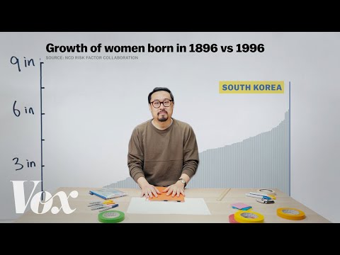
- I want to make you a chart of how tall people were 100 years ago.
I want to make you a chart of how tall people were 100 years ago.
- We'll chart heights by country.
We'll chart heights by country.
Starbucks Is Losing Momentum in the U.S., Can It Succeed in China? | WSJ News

- Well, here's a chart where you see Luckin in blue and Starbucks in green,
Well, here's a chart where you see Luckin in blue and Starbucks in green,
- Well, here's a chart where you see Luckin in blue,
Well, here's a chart where you see Luckin in blue,
Why Citibank Branches Are Closing Around The World
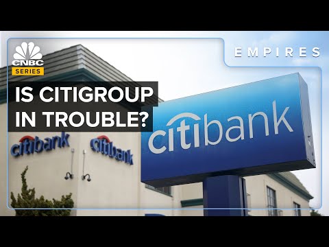
- If you look at a chart of the Citigroup stock, it's basically gone nowhere for the last 10 years.
If you look at a chart of the Citigroup stock, it's basically gone nowhere for the last 10 years.
- If you look at a chart of the Citigroup stock, it's basically gone nowhere for the last ten years.
If you look at a chart of the Citigroup stock, it's basically gone nowhere for the last ten years.
How 'Quiet Quitting' Became The Next Phase Of The Great Resignation

- This chart tracks job openings and labor turnover in the US economy, JOLTs for short.
This chart tracks job openings and labor turnover in the US economy, JOLTs for short.
- This chart tracks job openings and labor turnover in the U.S. economy, jolts for short.
This chart tracks job openings and labor turnover in the U.S. economy, jolts for short.
Why roller coaster loops aren't circular
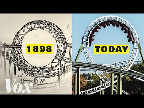
- You can see how wild the G forces are in this looping coaster simulation chart created by George Seidbotham, a mechanical engineering professor at the Cooper Union.
You can see how wild the G forces are in this looping coaster simulation chart created by George Seidbotham, a mechanical engineering professor at the Cooper Union.
- You can see how wild the G-forces are in this looping-coaster-simulation chart created by George Sidebotham, a mechanical engineering professor at the Cooper Union.
You can see how wild the G-forces are in this looping-coaster-simulation chart created by George Sidebotham, a mechanical engineering professor at the Cooper Union.
Things are changing at the world's oldest hotel
- still operating, but arguably just a name on an organisation chart.
still operating, but arguably just a name on an organisation chart.